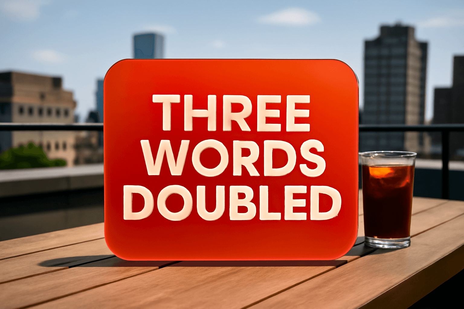
Three Words Changed This SaaS Homepage — Demo Requests Doubled
By Jonathan · Founder, PageGains
Most SaaS homepages lose visitors not because the product is weak — but because the copy describing it is doing the wrong job. One company found that out the hard way when months of paid traffic and a polished design were producing a demo request rate that barely moved. The fix wasn't a redesign. It wasn't a new pricing page. It was three words on a single button.
The Button That Was Costing Them Demos Every Day
The original CTA read: "Request a Demo."
It's the default. It's everywhere. And that's exactly the problem — it's so common that visitors read right past it. Worse, it frames the action as a bureaucratic step. You're requesting something. From a company. That will probably email you back in two business days.
The rewrite: "See It In Action."
Same button. Same placement. Same page. Demo requests doubled within three weeks of the change going live.
Here's why it worked: "Request a Demo" puts the cognitive weight on the visitor. They're initiating a process. "See It In Action" puts the weight on the product. The visitor isn't submitting a form — they're watching something happen. The micro-copy shift changes the entire emotional frame from administrative chore to instant gratification.
When you're auditing your own CTAs, ask yourself: does this label describe what the visitor does, or what they get? Those are different things, and only one of them converts.
Why Generic Verbs Kill SaaS Conversion Rates
"Get," "request," "submit," "start" — these verbs are so overused that they've lost all meaning. Visitors don't process them anymore. They're visual noise.
In a study of over 40 SaaS landing pages, CTAs using outcome-oriented language — "See Your Dashboard," "Watch the Walkthrough," "Get My Report" — consistently outperformed generic action verbs by 20–35% in click-through rate. The specificity signals to the visitor that something real and immediate is waiting on the other side of the click.
The rule of thumb: your CTA label should answer the question "What exactly am I about to experience?" Not the process. The experience.
If your product does scheduling, "Book Your First Meeting Automatically" beats "Get Started" every time. If it does analytics, "See My Live Data" beats "Try For Free." Map the label to the moment — the specific, tangible thing that happens right after the click — and your CTR will reflect it.
The "Visitor's Internal Voice" Test
Before any copy change goes live, run it through what I call the Visitor's Internal Voice Test. Read your CTA out loud in first person, as if you're the visitor saying it to yourself.
"Request a Demo" becomes: "I'm requesting a demo." That sounds like filling out a government form.
"See It In Action" becomes: "I'm going to see this thing work." That sounds like something worth doing.
This test works because it forces you to hear the copy from the outside. Most SaaS teams write copy from the inside — they know the product, they trust the process, they assume a demo is exciting. Visitors don't share that context. They're skeptical, they're busy, and they need the copy to do the persuasion work fast.
Run every button label, every headline, and every subhead through this test. If it sounds like corporate-speak when you say it out loud, it will read like corporate-speak on the page.
Placement Wasn't the Problem — But It Would Have Been Next
Once the copy change lifted demo requests, the team ran a scroll depth analysis. What they found: 61% of visitors who never clicked the CTA hadn't scrolled far enough to see the second one. The hero CTA was doing all the work.
This is extremely common. SaaS homepages tend to front-load the product pitch and then scatter CTAs without much logic. Visitors who aren't immediately convinced scroll for more information — and if they don't find a well-placed CTA when their interest peaks, they leave.
The fix is structural: place your primary CTA above the fold, repeat it after your strongest proof point (a stat, a customer quote, a before/after), and repeat it again at the bottom. Three placements minimum on any page longer than 800 pixels. The label doesn't have to be identical each time — in fact, varying the language slightly ("See It In Action" at the top, "Watch a 5-Minute Demo" mid-page) can reinforce the value proposition without feeling repetitive.
Don't make visitors hunt for the next step. Every scroll without a CTA is a micro-exit opportunity.
GET YOUR OWN AUDIT
Find these issues on your own page
PageGains analyzes any URL and surfaces these exact problems in ~60 seconds. First audit from $3.99.
Analyze my page →What the Surrounding Copy Was Doing Wrong (And How They Fixed It)
The button copy change drove the lift, but the audit surfaced a second problem: the headline above the CTA was vague.
Original headline: "The smarter way to manage your team."
That sentence could describe 400 different SaaS products. It gives visitors no signal about who this is for, what specifically it does, or why it matters. When the headline is abstract, the CTA carries the entire persuasion load — and even great button copy can't fully compensate for a headline that says nothing.
The rewritten headline: "Cut team check-ins from 3 meetings a week to one automated report."
Specific. Quantified. Targets a real pain point. Now the CTA ("See It In Action") has context — visitors know exactly what they're about to see, and why it's worth their time.
The lesson: CTAs and headlines are a system, not independent elements. Your headline creates the desire; your CTA captures it. If the headline is soft, the CTA has to work twice as hard. Tighten both, and they amplify each other.
The "Three Words" Framework You Can Apply This Week
You don't need a full redesign to test this. Here's the exact framework the company used — you can run the same process on your homepage in an afternoon.
First, pull your current primary CTA. Write down exactly what it says. Then write 10 alternatives that describe the specific experience the visitor is about to have — not the process, the experience.
Second, filter for specificity. Eliminate anything that could apply to a competitor's product. What's left should be unique to what your product actually does in that first moment.
Third, run the Internal Voice Test on your top three. Kill any that sound like a form submission.
Fourth, A/B test the winner against the control. Run it until you hit statistical significance — don't call it early. Use a tool like VWO or Convert, set your significance threshold at 95%, and give it at least two weeks if your traffic is moderate.
This is a low-effort, high-leverage test. It takes an afternoon to set up and the results typically come in within three to four weeks. It's the kind of change that makes a lot of teams wish they'd done it six months ago.
Why This Works Especially Hard on Demo-Gated Products
For products where the demo is the conversion event — not a free trial, not a freemium signup — the CTA copy carries disproportionate weight. You're asking visitors to give up 30 minutes of their calendar. That's a much higher commitment than starting a free trial.
The more the CTA frames that commitment as their loss if they skip it, rather than your gain if they book, the better it performs. "See It In Action" does this. "Watch How Teams Cut Meetings by 60%" does this harder. "Request a Demo" does the opposite — it centers your process, not their outcome.
This distinction matters even more when your buyer is a busy manager or a skeptical VP. These are people who decline calendar invites for a living. Your CTA needs to make the demo feel like the most efficient use of 30 minutes they'll spend this week — not like a vendor meeting they have to prepare for.
The copy sets the expectation. Set it around value, not logistics.
GET YOUR OWN AUDIT
Find these issues on your own page
PageGains analyzes any URL and surfaces these exact problems in ~60 seconds. First audit from $3.99.
Analyze my page →The Bottom Line
Three words is not a small change. In CRO, the smallest surface area often carries the highest leverage — and a homepage CTA is the single most-clicked element on most SaaS sites. Rewriting it isn't a minor tweak; it's a direct intervention at the moment a visitor decides whether to go further or leave.
The company in this case doubled demo requests not because they found a magic phrase, but because they stopped writing copy for themselves and started writing it for the visitor's internal experience. That shift — from process language to outcome language, from what the visitor does to what they get — is the underlying principle behind every version of this test that works.
If your demo request rate is flat and you haven't touched your CTA copy in the last six months, that's the first thing to test. Not a new hero image. Not a pricing page restructure. Three words. Run the audit this week, build the test, and let the data tell you what your visitors actually respond to. The answer is almost always more specific — and more human — than what's currently on the page.