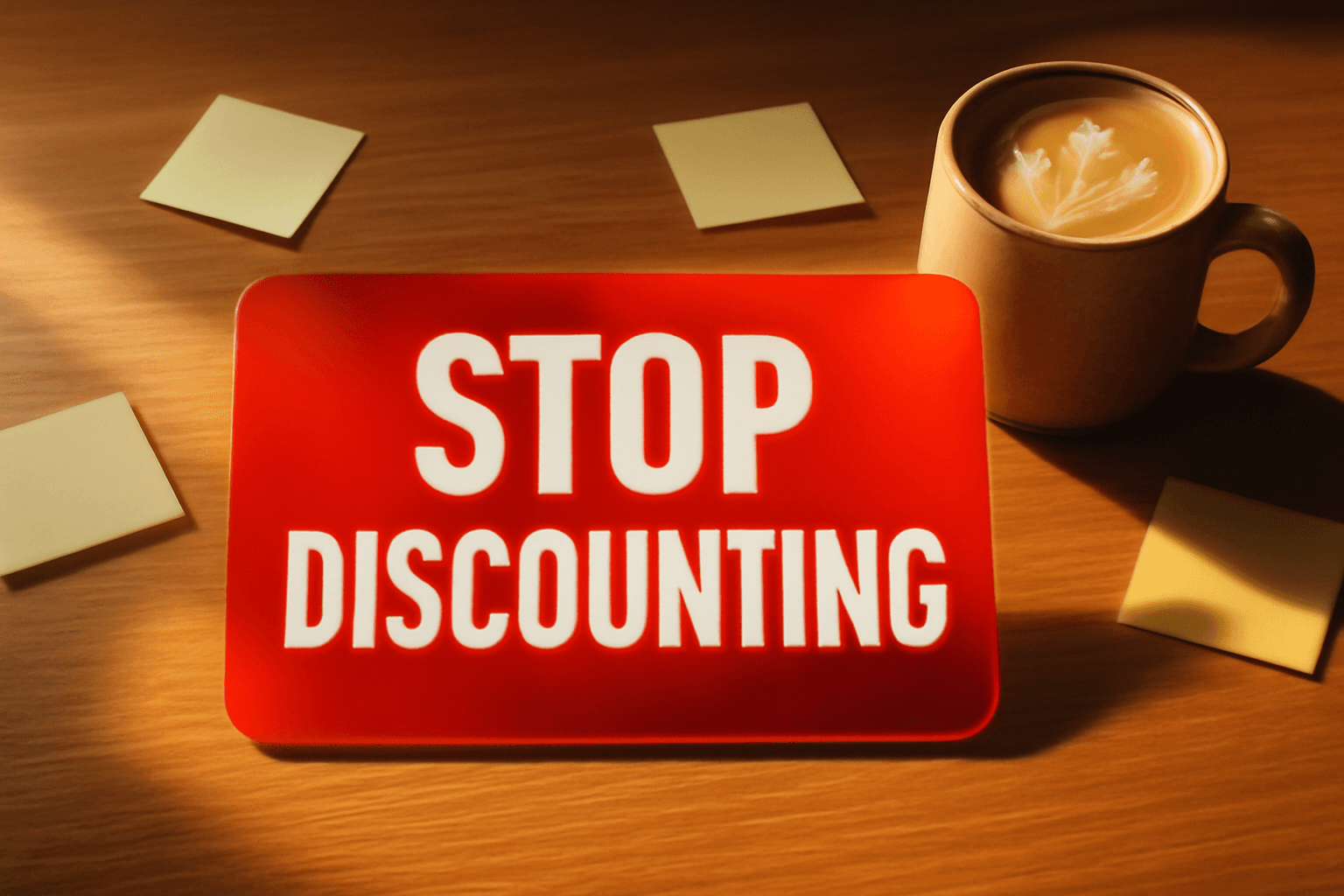
Stop Discounting: 7 Things High-Converting Stores Do Instead to Close the Sale
By Jonathan · Founder, PageGains
Most e-commerce stores reach for a discount the moment conversion rates dip — a 10% off popup here, a sitewide sale there. It feels like it's working because revenue ticks up. But what's actually happening is you're training your customers to wait, eroding your margins, and making it nearly impossible to sell at full price ever again. The stores consistently converting at 4%, 5%, even 7%+ aren't doing it by racing to the bottom on price. They're doing something else entirely.
The Discount Trap: What You're Actually Teaching Your Customers
When Pottery Barn runs a sale every three weeks, customers learn to never pay full price. This isn't cynicism — it's conditioning. Research from McKinsey found that frequent promotions can erode brand value and make price the primary purchase driver, which is the last place a branded retailer wants to compete.
The practical damage: your email list starts ignoring non-promotional sends. Your return customers hold purchases until the next sale. Your CAC climbs because you're essentially running a loyalty program that rewards delay, not purchase intent.
Before you run another discount, ask: are you solving a real objection, or are you just reducing friction with a sledgehammer? Because if the reason someone isn't buying is uncertainty about fit, shipping anxiety, or confusion about the product — a 15% coupon doesn't fix any of those things. It just masks them temporarily.
Lead With Value Anchoring, Not Price Reduction
Value anchoring means making the full price feel like the obvious deal — without touching the number itself. Apple does this in every product page. Before you even see the price, you've seen the materials, the engineering, the comparison table against older models.
The tactical version for a smaller store: restructure your product page so the price appears after the value case has been made. Lead with the specific outcome the product delivers. Then list materials, dimensions, or technical specs. Then show the price. Visitors who scroll past your value case before hitting the price convert at meaningfully higher rates than those who see price first.
If you sell a $180 leather wallet, the page shouldn't open with the price widget. It should open with "Built to last 10 years. Most wallets are replaced every 18 months." Now $180 reads differently. You haven't changed the number — you've changed what the number is being compared to.
Use Urgency That's Real, Not Fake
Countdown timers that reset every time someone visits are everywhere, and customers have learned to ignore them — or worse, to distrust the store running them. Fake urgency is a conversion tax you pay in credibility.
Real urgency converts because it's true. "Only 3 left in stock" when it's actually true creates action. A product launch window that closes Friday because you're genuinely moving to pre-order only creates action. A limited production run that won't be restocked creates action.
The fix isn't removing urgency — it's building your offers around genuine scarcity. If your product is always in stock, create urgency around something else: a free gift with orders placed before a specific date, a bonus that expires when a new shipment arrives, or a founding-member price that's only valid before your next price update (if you're genuinely planning one).
One mid-size apparel brand shifted from fake countdown timers to real low-stock badges pulled from their inventory system. Conversion rate on low-stock product pages went up 11% within 30 days. Nothing else changed.
Make Risk Disappear With Guarantees That Are Actually Specific
"30-day money-back guarantee" is table stakes. Every store offers some version of it. The problem is generic guarantees don't move the needle because they don't address specific fears.
Think about what your customers are actually afraid of. For apparel, it's fit. For supplements, it's whether it'll work for them. For furniture, it's whether it'll look right in their space. A guarantee that targets the specific fear converts far better than a blanket refund policy.
Casper didn't just offer returns — they offered a 100-night sleep trial, which directly addresses the "but what if I hate sleeping on it?" objection. Bonobos built their brand around free return shipping, targeting the core fit anxiety of buying pants online.
Your version: identify the single biggest reason a ready-to-buy customer hesitates. Then write a guarantee that speaks directly to that thing. "If it doesn't fit perfectly, we'll cover return shipping, no questions asked" is worth more than "satisfaction guaranteed" to someone anxious about fit.
GET YOUR OWN AUDIT
Find these issues on your own page
PageGains analyzes any URL and surfaces these exact problems in ~60 seconds. First audit from $3.99.
Analyze my page →Bundle Strategically Instead of Discounting Individually
Bundles solve a real problem for the buyer while protecting your margin. Instead of cutting 20% off a single item, you're adding value by pairing it with something complementary — and often increasing average order value at the same time.
The key is that the bundle has to feel curated, not like a dump of slow-moving inventory. "The Weekend Kit" from a skincare brand feels intentional. "Assorted Items Bundle" does not.
Structurally, a well-built bundle gives the customer the feeling of getting more without you having to signal that your core product isn't worth its price. A coffee brand selling a $38 bag of beans can bundle it with a $12 hand grinder and a brewing guide for $44. The customer gets $50+ of value at $44. The brand moves volume on accessories and maintains the integrity of their flagship product's price point.
For existing stores, start with your top 3 SKUs and ask: what does someone need alongside this to get full value from it? That answer is usually your bundle.
Fix the Page Before You Touch the Price
This one gets skipped constantly. A store's conversion rate is sitting at 1.4% and the first instinct is to add a discount. But often the conversion problem isn't price — it's the page itself confusing or losing the visitor before they ever evaluate price.
Run a session recording audit (Hotjar, Microsoft Clarity — both have free tiers). Look for rage clicks, drop-off points, and how far visitors actually scroll on your product pages. You'll often find that a significant portion of visitors never scroll past the fold, which means they're not even seeing your product images or key copy, let alone your price.
Common fixable issues that kill conversions with no price change needed: product images that don't show scale, shipping cost only visible in the cart, no clear "returns" link near the CTA, review counts too small to register credibility. Fix these first. Many stores see a 15–25% lift in conversion by cleaning up friction points before they ever touch pricing strategy.
Loyalty Programs That Reward Purchase Frequency, Not Just Spend
Most loyalty programs are discount programs wearing a costume. "Earn points to get money off" is just a delayed discount — and it has the same margin-eroding side effect over time.
High-converting stores use loyalty to create identity, not just savings. Patagonia's Worn Wear program builds loyalty through repair and sustainability identity. REI's co-op membership creates a sense of ownership. Neither of these is primarily about getting money off your next purchase.
For smaller stores, the practical version is a tiered program where higher tiers unlock access, not just discounts. Early access to new products, free expedited shipping, members-only colorways. These create status, which people value more than a coupon — and it costs you less per customer.
The structural test: would your best customers stay in the program if you removed the dollar-off rewards? If the answer is no, your loyalty program is a discount in disguise.
Social Proof Positioned Where Doubt Lives, Not Just at the Bottom
Review widgets at the bottom of the product page are nearly useless. By the time a reluctant visitor gets there, they've often already decided not to buy. Social proof needs to be placed where doubt is highest — right next to the CTA, right next to the price, right next to the thing causing hesitation.
If your core objection is "will this actually look good in my home," your most persuasive reviews are photos from real customers in real spaces — and those photos should be near the add-to-cart button, not buried in a 47-review carousel at the footer.
Specific format: pull the two or three reviews that speak most directly to your top objections and pin them near your CTA. A three-star concern addressed by a five-star response is often more persuasive than 200 reviews averaged together. It shows you're paying attention and that the product delivers even for skeptics.
GET YOUR OWN AUDIT
Find these issues on your own page
PageGains analyzes any URL and surfaces these exact problems in ~60 seconds. First audit from $3.99.
Analyze my page →The Bottom Line
Discounts aren't inherently wrong — they have a role in clearing inventory, rewarding loyalty on your terms, or competing on a specific channel. The problem is when they become the default response to any conversion challenge, because they are the most expensive tool in the toolkit, and the hardest habit to break once customers expect them.
The stores that convert consistently well — without running perpetual sales — have built pages that remove doubt, offers that add value, and trust signals placed where they actually matter. None of this requires a bigger budget. It requires being specific about what's stopping your visitor from buying right now, and addressing that thing directly.
Start with one section of this list. Fix the page first. Build a real guarantee. Move your best review next to the CTA. Measure it. The compounding effect of getting these basics right usually outperforms any discount you could have run — and it doesn't cost you a point of margin.