#01
△ CRITICAL
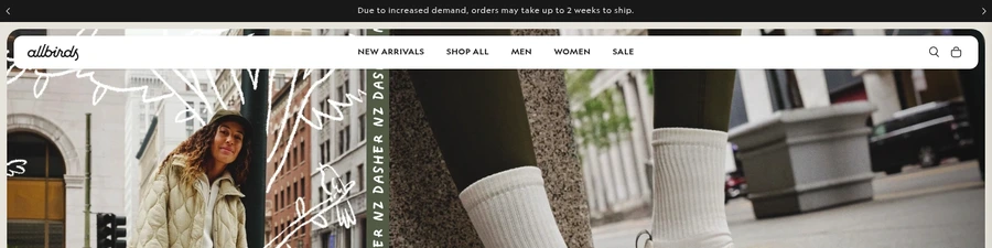
Negative shipping notice creates immediate friction
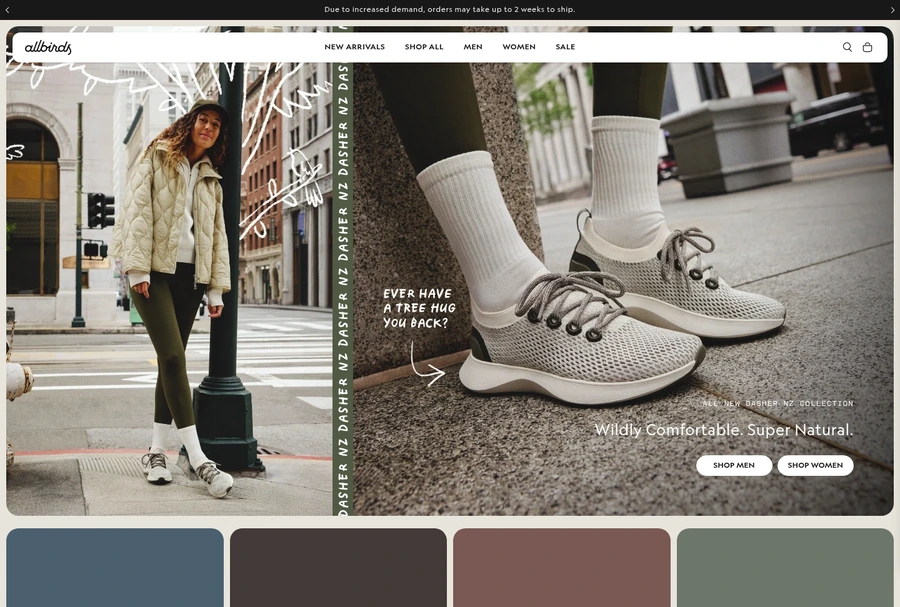
The top announcement warns that orders may take up to 2 weeks to ship, creating uncertainty before the shopper sees products.
+0–2%Est. lift
▼

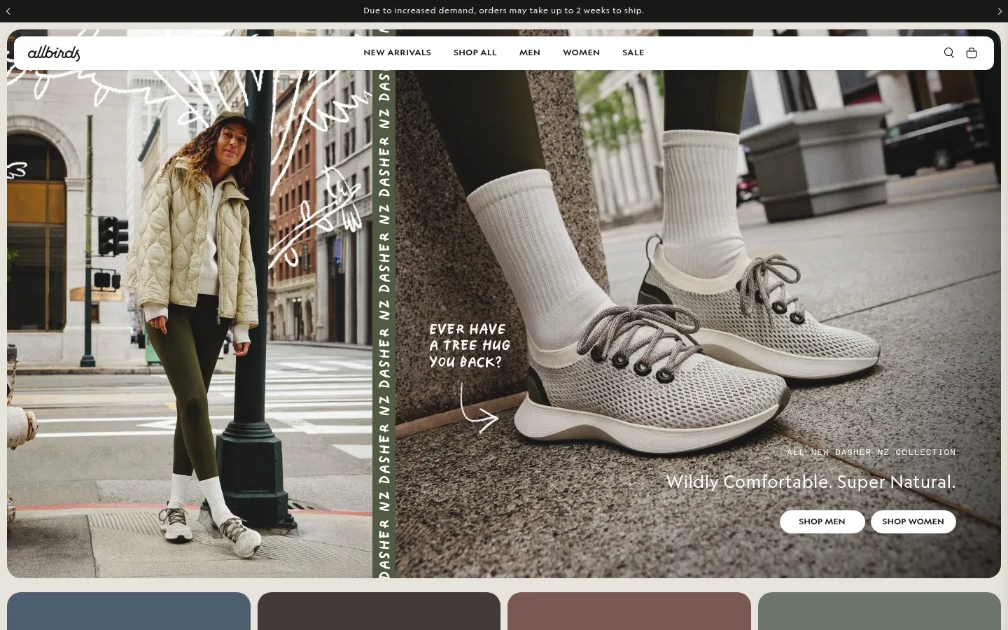
Allbirds has built a recognizable brand around sustainable footwear, and the landing page reflects that identity clearly through visual design and messaging consistency. However, the page prioritizes brand expression over conversion clarity, leading to a below-average trust score (54) and friction issues that compound during the critical first-impression moments. The most damaging leak occurs before the fold: a shipping delay warning immediately creates purchase anxiety, the hero value prop fails to differentiate, and the dual gender CTAs force a choice without sufficient context or reassurance.
Move the shipping notice below the fold or reframe it as a realistic delivery expectation rather than a warning that reads like a supply problem.
The top announcement warns that orders may take up to 2 weeks to ship, creating uncertainty before the shopper sees products.
Replace the brand-focused headline with a specific claim about what Allbirds offers (e.g., comfort, sustainability, or material innovation) and why now matters.
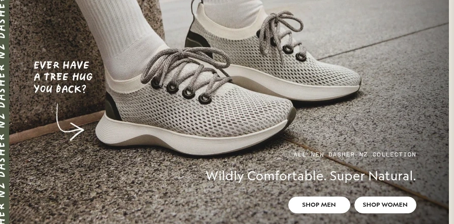
The hero headline is on-brand but does not clearly explain what makes Allbirds different or why a shopper should buy now.
Route visitors through a single primary CTA—either "Shop Now" or a single-step collection filter—rather than splitting intent between gender categories before trust is established.
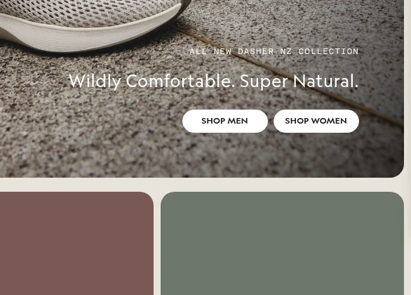
The hero presents equal-weight buttons for Shop Men and Shop Women, forcing an immediate gender choice before providing enough context.
Surface at least one trust signal (rating aggregate, review count, or press mention) in or immediately below the hero to counter the opening friction.
There are no visible ratings, reviews, testimonials, press logos, or UGC in the hero area or immediately below it.
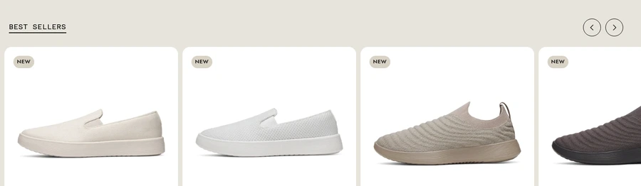
Remove the cropped card visual and replace small arrows with an explicit "View all bestsellers" button or carousel indicator to signal browsability.
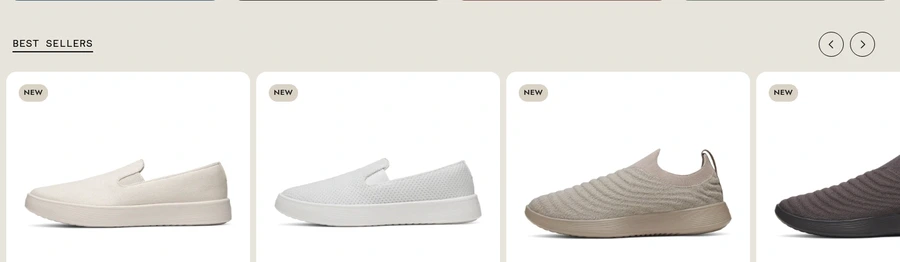
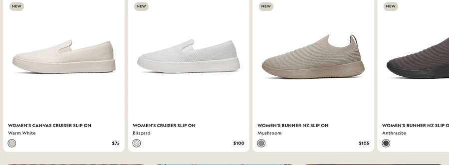
The product row shows a cropped fourth card and relies on small arrows without any clear cue to browse more.
SEE THESE ISSUES ON YOUR PAGE
How would your landing page score?
Add rating stars, review counts, and fit guidance (XS/S/M sizing cues) to product cards to reduce decision friction and enable quick-add workflows.
Best-seller cards show name, color, and price, but not ratings, review counts, fit notes, or quick-add options.
The homepage shows prices, but they are not anchored by savings, guarantees, or other value cues.
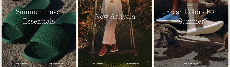
Editorial-style tiles use generic headlines and low-emphasis buttons that do not clearly explain why the visitor should click.
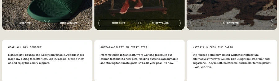
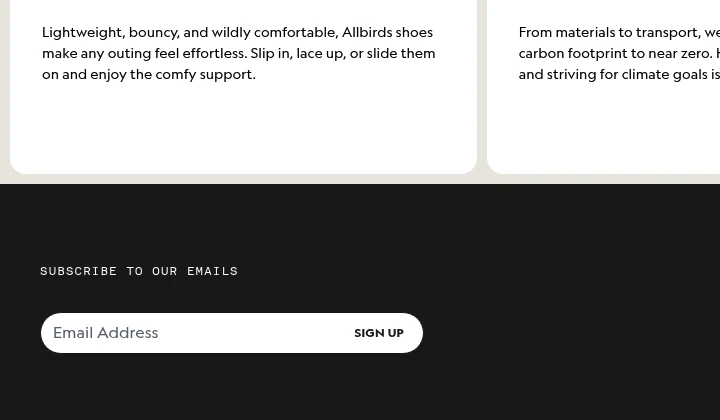
The sustainability messaging mentions materials and carbon reduction without nearby numbers, certifications, or proof points.
Beyond the negative shipping warning, the page does not show low stock, selling fast, or limited-time messaging.
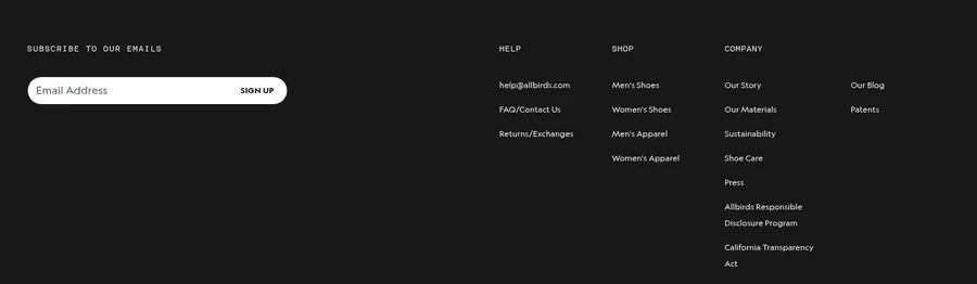
The email capture area asks for signup but does not explain what the visitor gets in return.
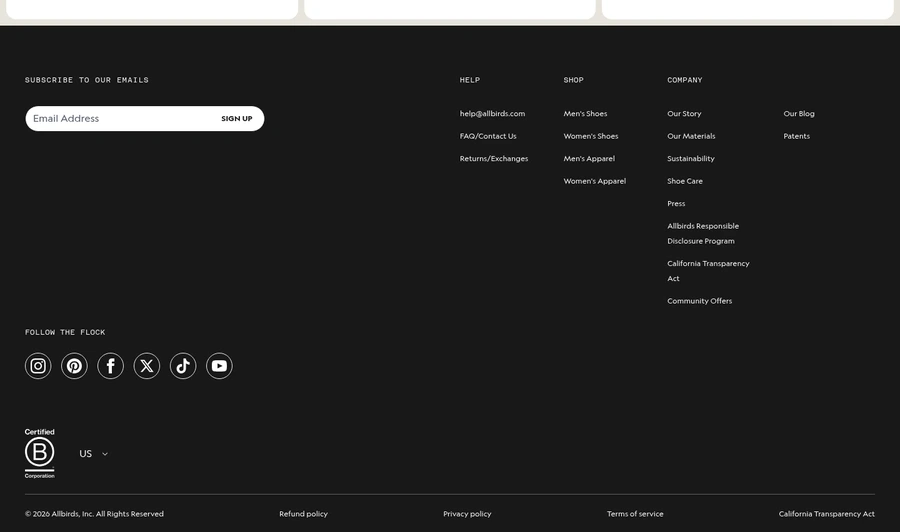
Key reassurance elements like returns, privacy, terms, and the B Corp badge only appear at the bottom of the page.
The lower footer is visually large and link-heavy, but it does not add much purchase support or objection handling.
GET YOUR OWN AUDIT
First audit just $4.99. Results in ~60 seconds. Money-back guarantee.
Audit my page — $4.99 →