#01
△ CRITICAL
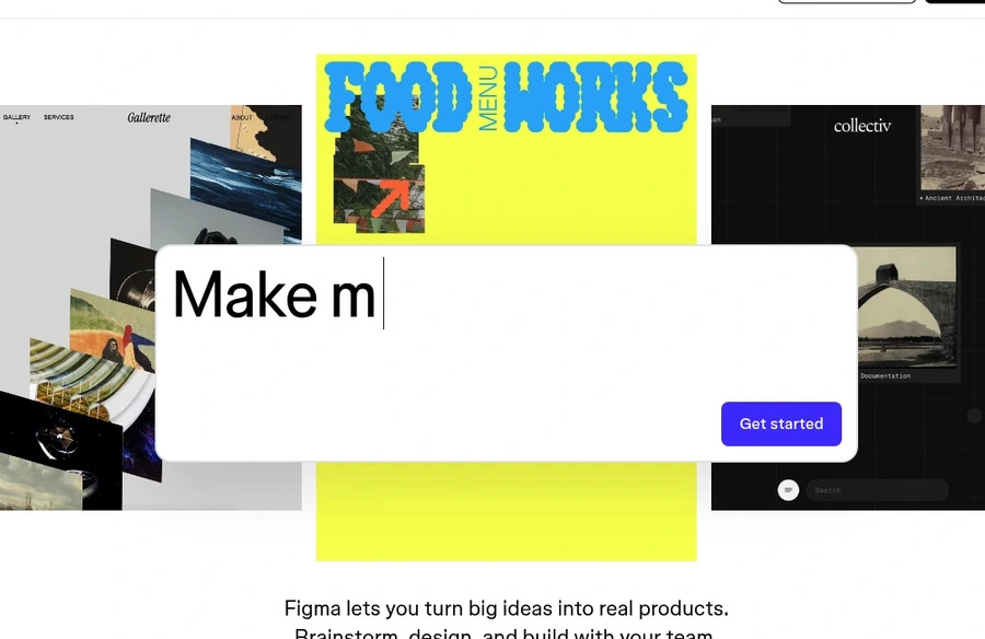
Hero value proposition feels abstract
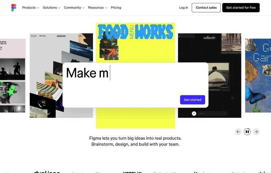
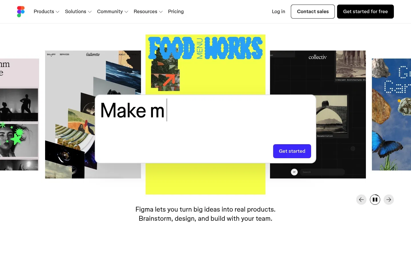
The hero message is visually clever but incomplete and broad, with partial text that obscures the core value proposition.
+1–2%Est. lift
▼

Figma's landing page demonstrates strong brand recognition and visual polish, with a trust score of 78 reflecting genuine market credibility and social proof. However, the page struggles with conversion clarity and decision friction, particularly evident in its 58 friction score. The hero section prioritizes aesthetic sophistication over message clarity, and the navigation architecture creates competing calls-to-action that dilute the primary conversion goal. These issues suggest the page optimizes for brand impression over visitor conversion.
Replace partial, abstract hero text with a single, complete value statement that explains what Figma does and for whom in under 10 words.
The hero message is visually clever but incomplete and broad, with partial text that obscures the core value proposition.
Simplify hero visuals to a single, focused product screenshot or demo that reinforces the CTA rather than competing with it.
The first viewport is busy with collage elements, central artwork, and controls that pull attention away from the signup action.
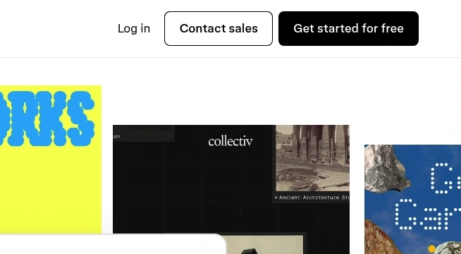
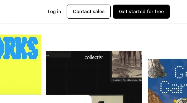
Separate Log In from Get Started For Free in the nav—either remove Log In or place it in a secondary menu to eliminate action ambiguity.
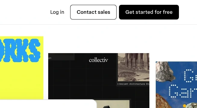
The top navigation presents Log in, Contact sales, and Get started for free together, with Contact sales styled close to the primary action.
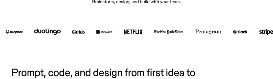
Move customer logos to the hero section, immediately below or adjacent to the primary CTA, before any secondary content.
Strong brand logos are present but only appear after the first fold instead of immediately near the first CTA.
Identify and promote one primary user path (e.g., 'Design teams') above the fold; move secondary products (AI, whiteboarding, templates) to dedicated sections below.
The homepage promotes many tools and categories at the same level, including design, dev, whiteboarding, AI, templates, and more.
SEE THESE ISSUES ON YOUR PAGE
How would your landing page score?
Add a simple pricing callout near the CTA stating 'Free forever for individuals' or your key pricing differentiator to reduce signup hesitation.
There is no visible in-page explanation of free versus paid plans or a simple pricing summary near the main CTA.
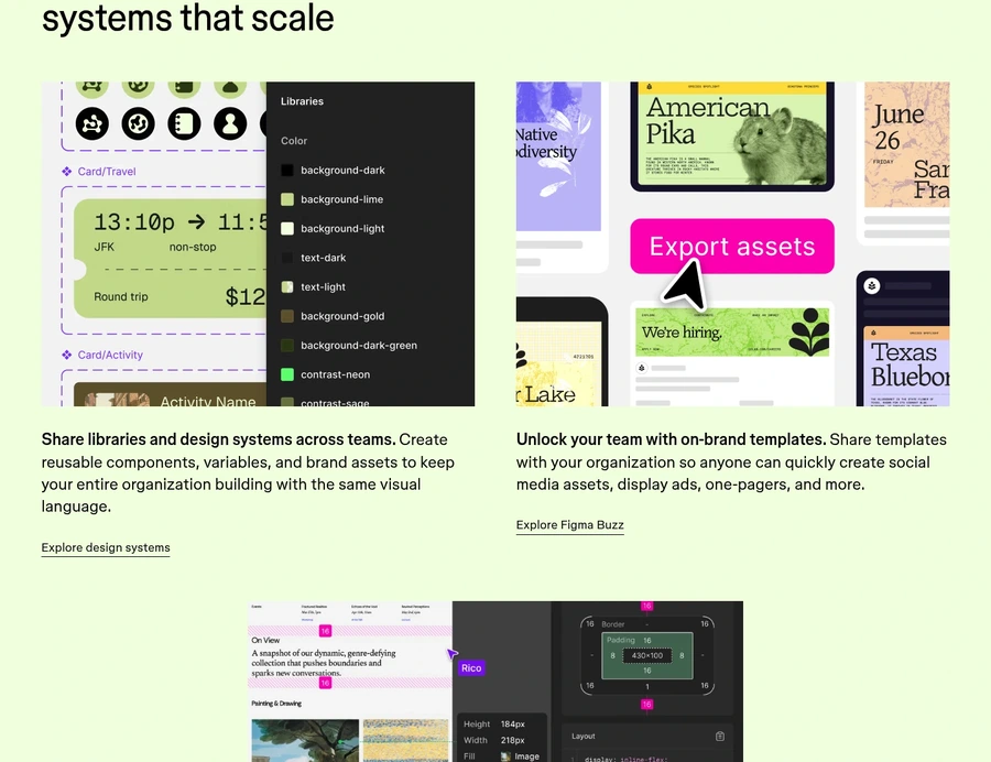
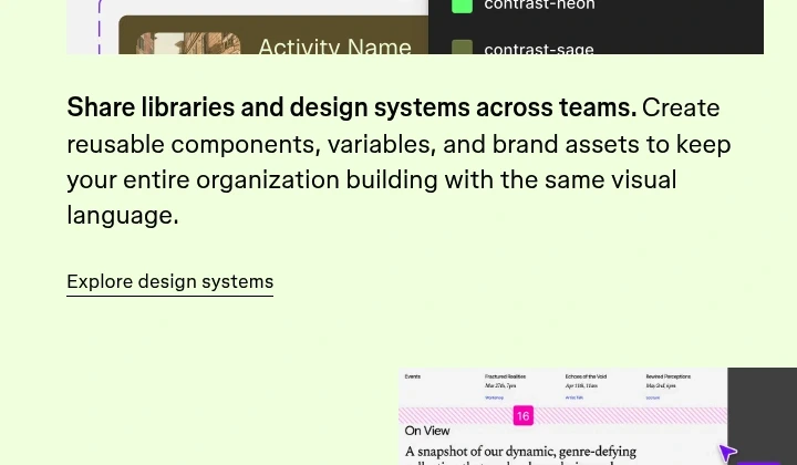
Mid-page calls to action such as Explore design systems and Explore Figma Buzz are plain underlined text links with low visual prominence.
The quotes are credible but mostly high-level praise rather than specific business results or measurable improvements.
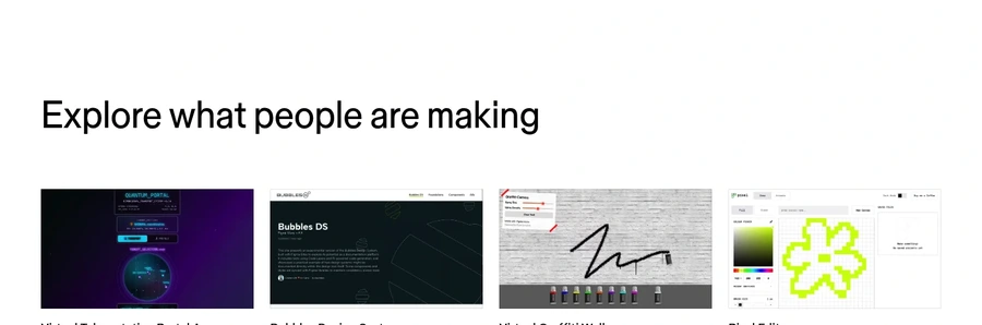
The gallery showcases examples but does not explain why the examples matter or what action to take next.
The prominent Get started for free button appears without nearby supporting proof, setup guidance, or friction-reducing copy.
The section promises versatility but does not explain what templates exist or what outcomes they support.
Security, privacy, and enterprise readiness signals are not surfaced close to the primary conversion points.
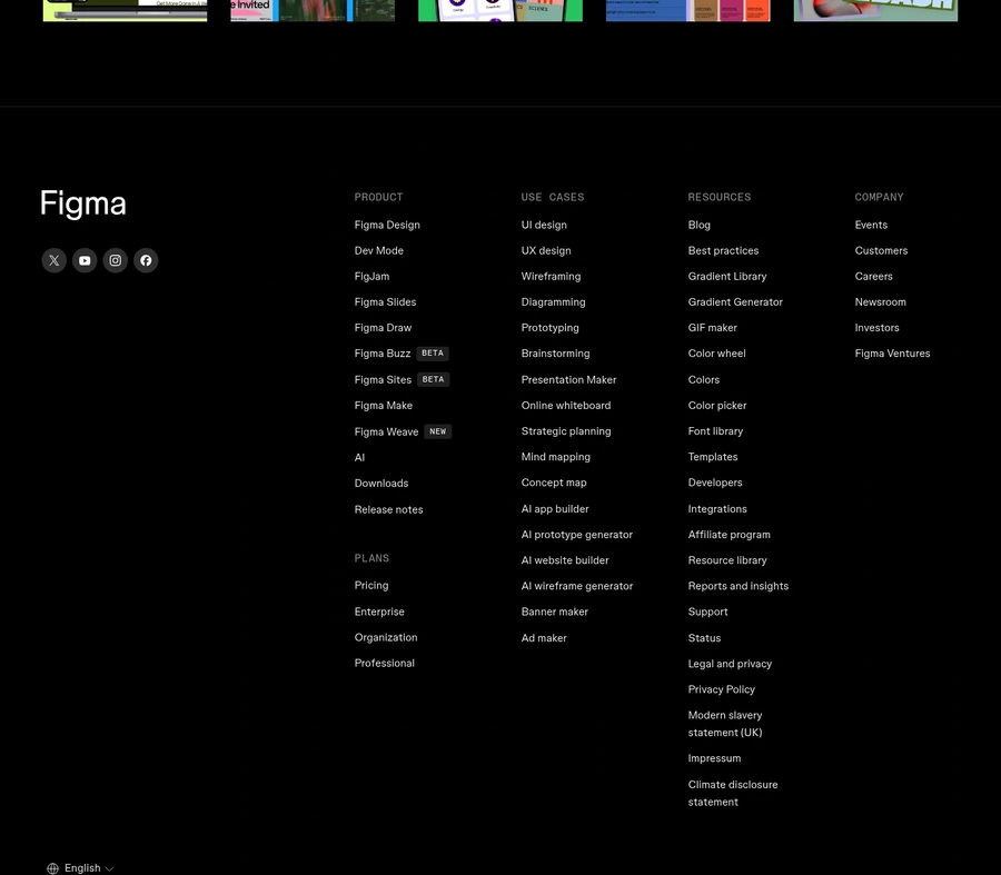
The footer is useful but ends with navigation and legal links instead of a final signup or sales CTA.
GET YOUR OWN AUDIT
First audit just $4.99. Results in ~60 seconds. Money-back guarantee.
Audit my page — $4.99 →