#01
△ CRITICAL
Navigation creates too many exits
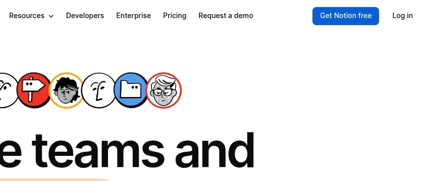
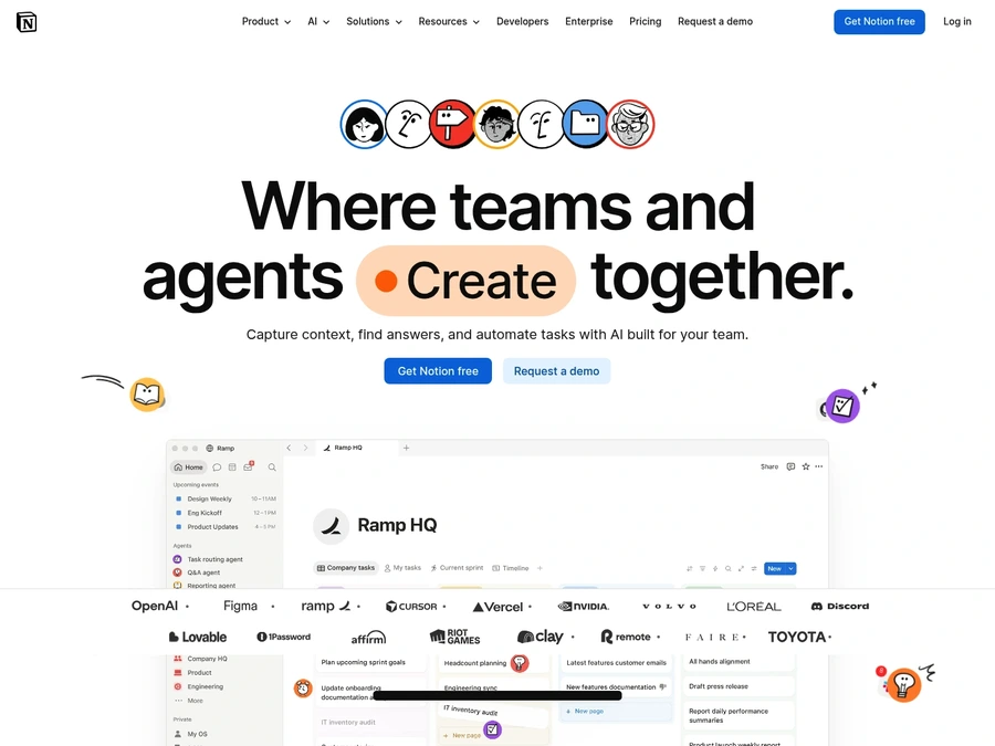
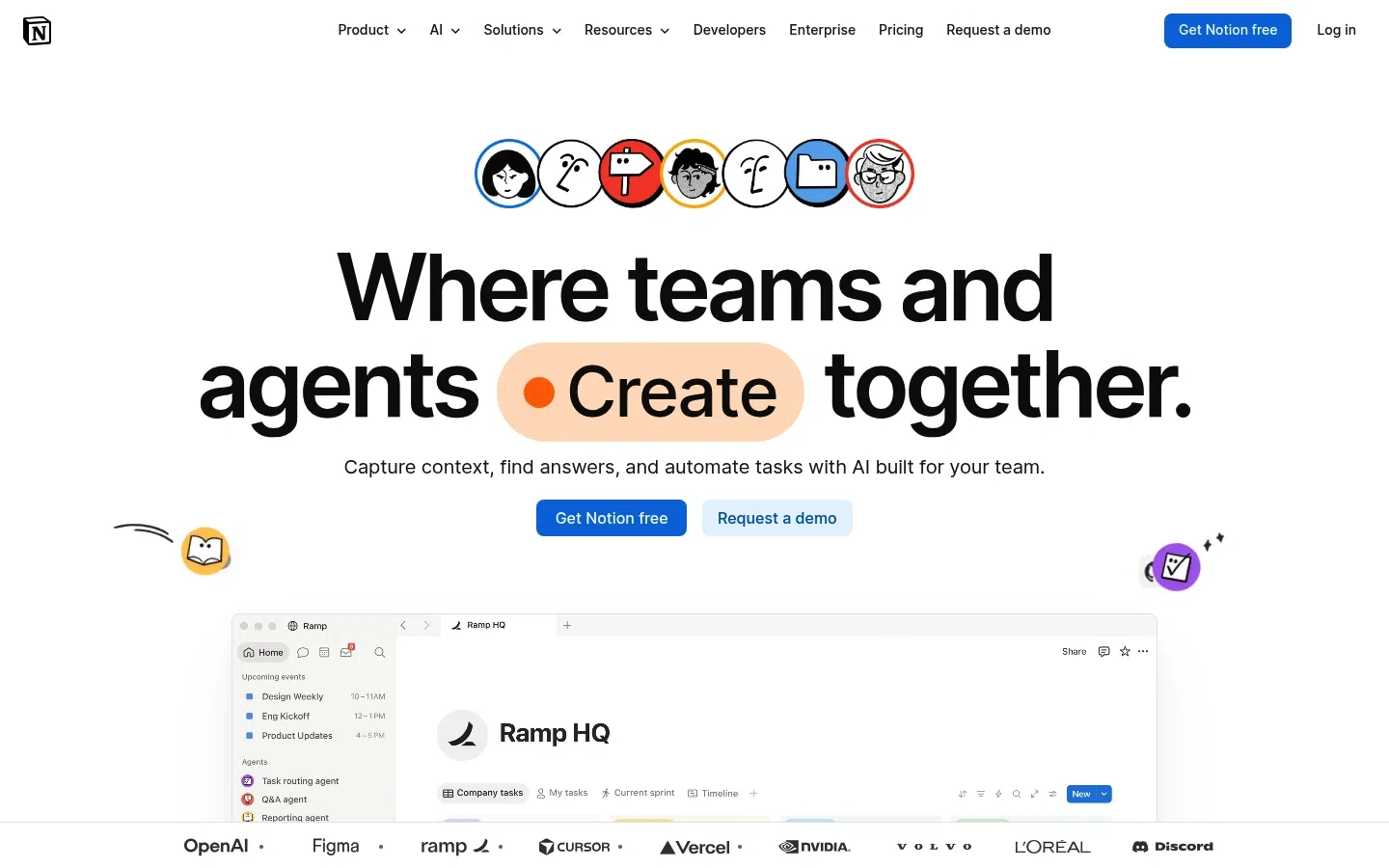
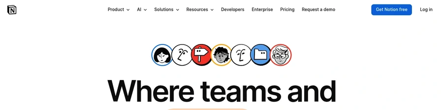
The header presents too many competing links and CTAs, including Product, AI, Solutions, Resources, Developers, Enterprise, Pricing, Request a demo, Get Notion free, and Log in.
+1–2%Est. lift
▼

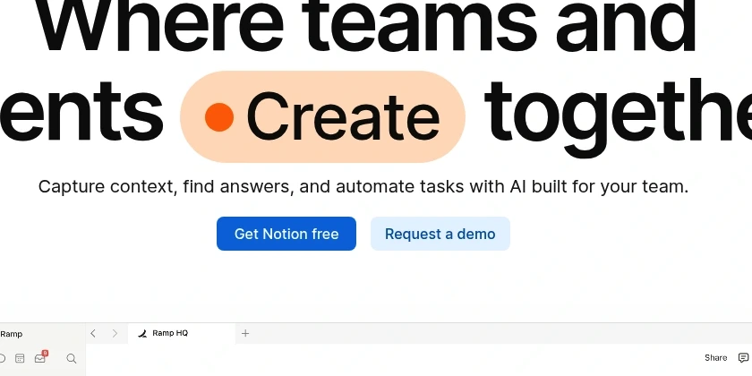
Notion's landing page demonstrates strong brand positioning and trust signals, evidenced by the 83/100 trust score. However, the page sacrifices conversion clarity for conceptual boldness. The hero headline 'Where teams and agents Create together' prioritizes brand narrative over functional clarity, forcing visitors to infer what Notion does rather than immediately understanding its value. This aspirational messaging, while memorable, creates friction for first-time users who don't yet have mental models for the product.
The primary conversion leak emerges from navigation and CTA strategy. The header offers 10 distinct exits (Product, AI, Solutions, Resources, Developers, Enterprise, Pricing, demo request, free signup, login), fragmenting attention before visitors have committed to exploring. Simultaneously, the two hero CTAs—'Get Notion free' and 'Request a demo'—are visually equivalent and lack differentiation, forcing visitors to choose without clear guidance on which path serves their needs. The free offer itself omits critical reassurance language around trial length and payment requirements, introducing friction precisely where conversion should accelerate.
Reduce header navigation to 4-5 primary items and relocate Enterprise/Developers/Resources to footer to stop early exits.
The header presents too many competing links and CTAs, including Product, AI, Solutions, Resources, Developers, Enterprise, Pricing, Request a demo, Get Notion free, and Log in.
Replace 'Where teams and agents Create together' with a headline that leads with use case (e.g., 'One workspace for docs, databases, and AI automation') before brand voice.
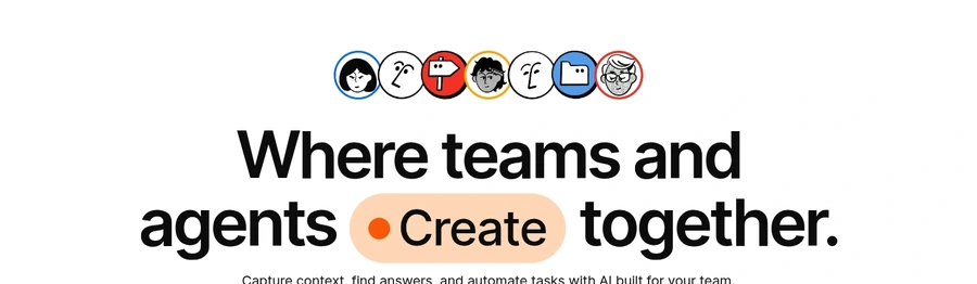
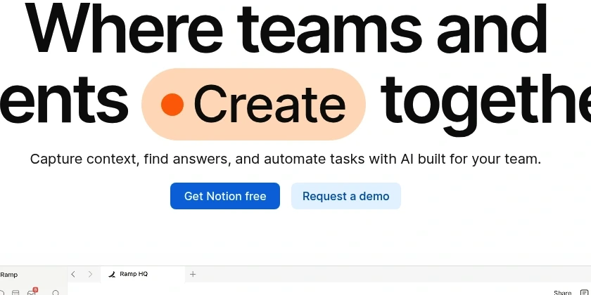
The headline 'Where teams and agents Create together.' is brand-forward but does not immediately explain what Notion is or why it matters.
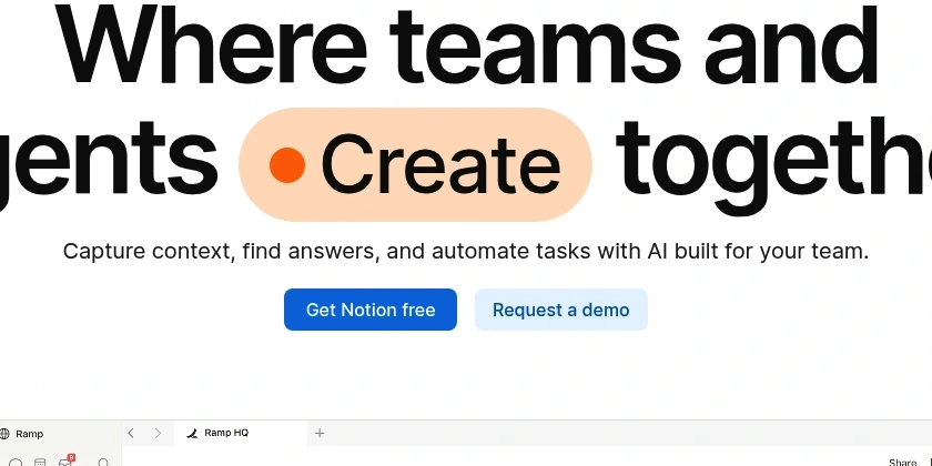
Visually demote 'Request a demo' in the hero—use subtle link styling—and make 'Get Notion free' the primary CTA with clear badge language ('Free forever, no card required').
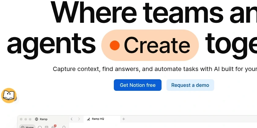
Get Notion free and Request a demo are both prominent and visually similar, even though they serve different audiences.
Add one-line reassurance copy beneath 'Get Notion free' stating trial duration and payment policy to remove signup hesitation.
The CTA says 'Get Notion free' but does not clarify whether it is free forever, a trial, or whether a credit card is required.
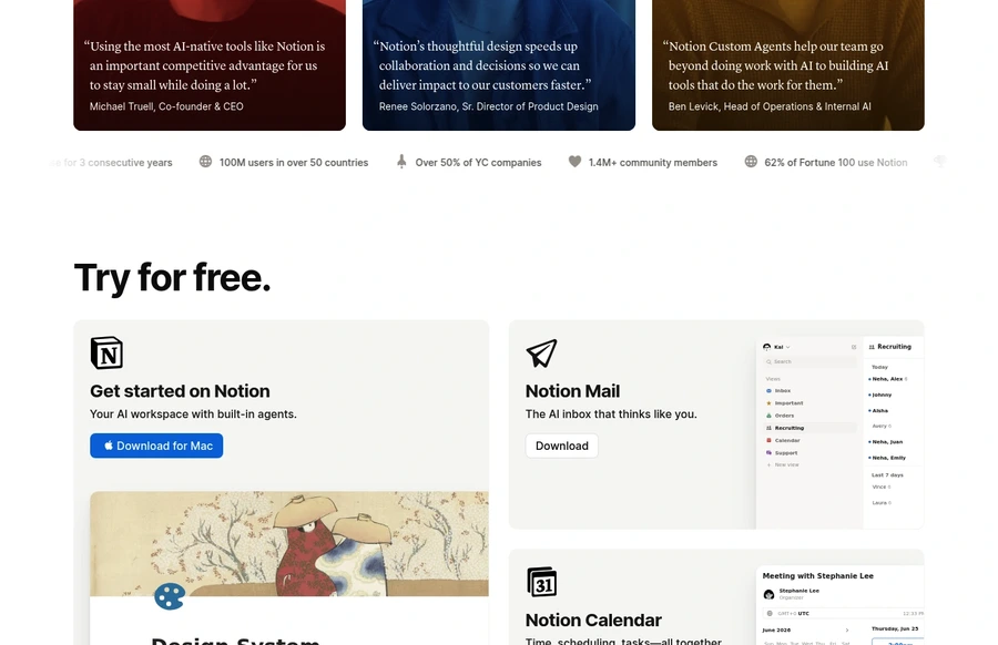
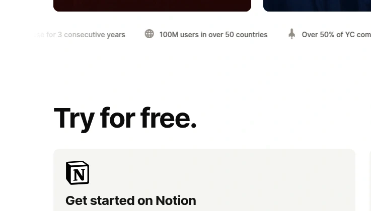
The 'Try for free' area mixes Notion, Notion Mail, Notion Calendar, and other products, making the offer feel broad and somewhat fragmented.
SEE THESE ISSUES ON YOUR PAGE
How would your landing page score?
Expand the Forbes Cloud 100 proof point with logo lockup or increase type size by 20% to match visual weight of the hero claim.
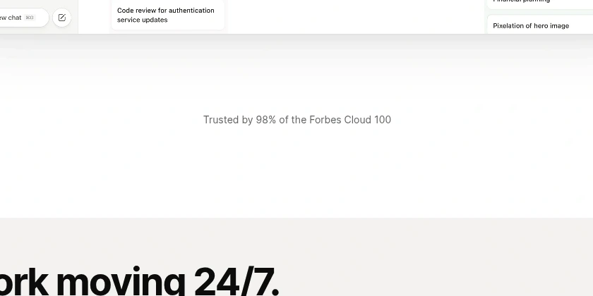
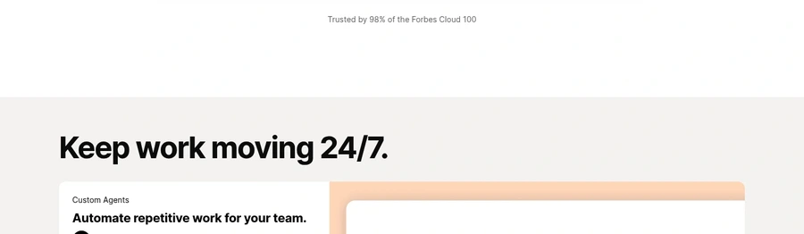
The 'Trusted by 98% of the Forbes Cloud 100' proof point is strong but visually understated relative to the hero.
Reduce whitespace between hero and next section by 30-40% or insert a secondary value hook (e.g., 'Trusted by 10k+ teams') to maintain momentum.
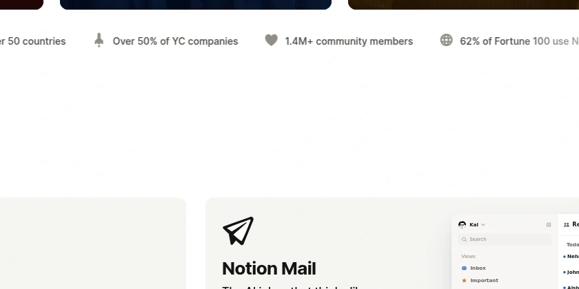
There is a noticeable gap between the hero proof and the next value section.
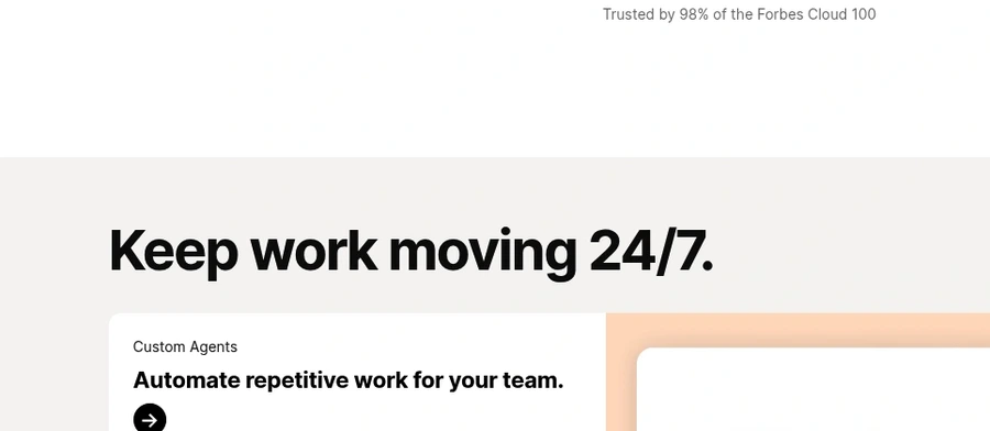
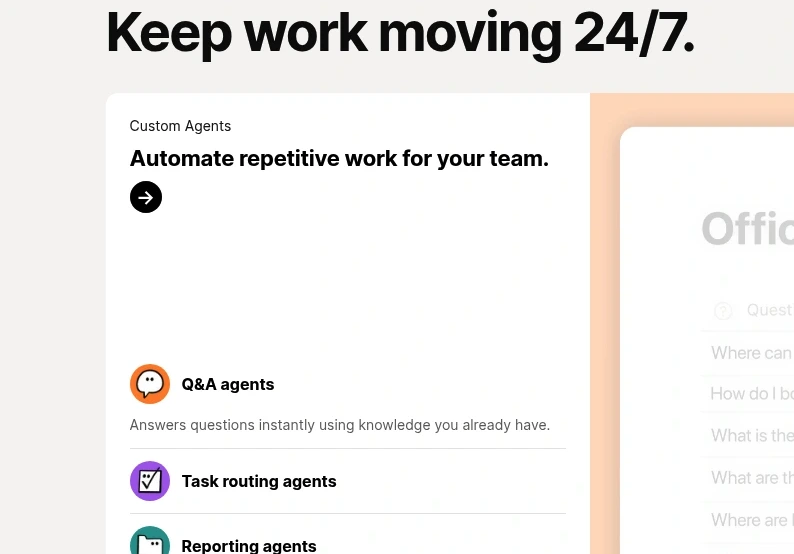
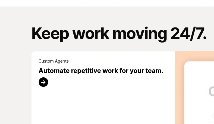
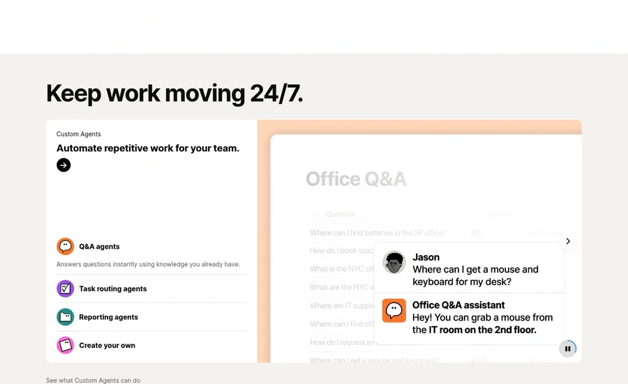
The headline 'Keep work moving 24/7.' sounds energetic but does not say what specifically is being improved.
The 'Custom Agents' section is visually polished but does not clearly explain what it does, who it is for, or why it matters.
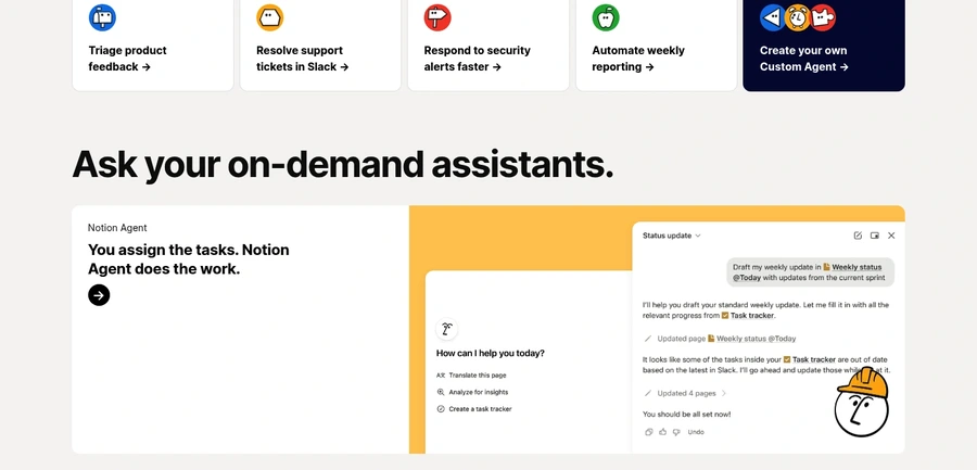
Several sections use only a circular arrow icon as the main interaction without saying what happens next.
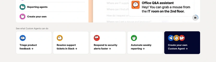
The use-case cards list several tasks but do not guide visitors on which one matters most or how to start.
The 'Ask your on-demand assistants' section introduces another layer of AI capability without clearly explaining the progression from earlier agent content.
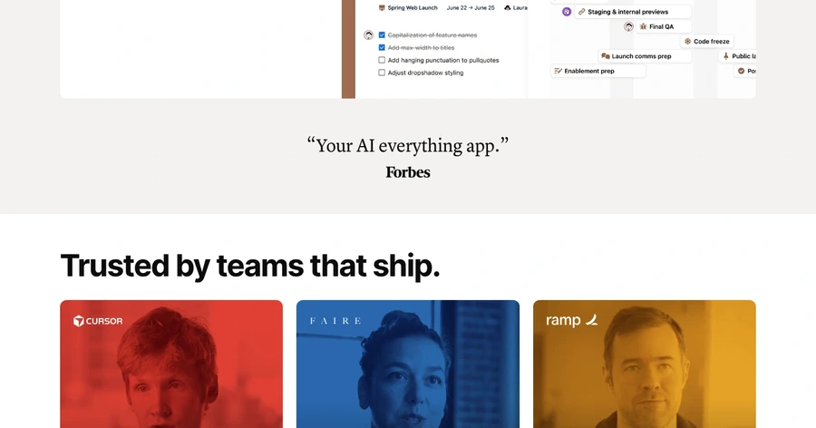
The testimonial section uses compelling media but buries the main claims in long text blocks.
The first CTA in the free section is 'Download for Mac,' which is restrictive for non-Mac visitors.
Pricing is only surfaced in the navigation and footer, not in the main persuasion narrative.
There is no visible reassurance such as no credit card, cancellation terms, or security trust cues adjacent to the main CTA.
The page shows many capabilities but rarely quantifies the business outcome users get from them.
The page speaks to teams, agents, enterprises, builders, and individuals all at once without clear audience paths.
The stats strip beneath testimonials uses light gray styling that makes the numbers easy to overlook.
The download CTAs are generic and do not explain what the user gets or whether sign-up is required.
The page does not provide any time-sensitive reason to act now.
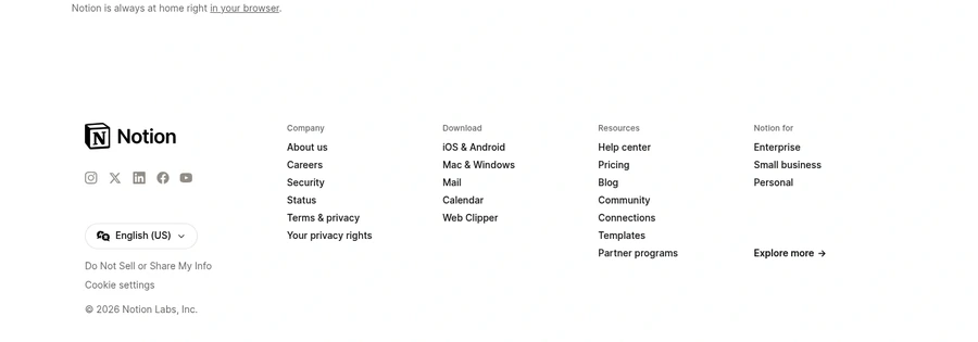
The footer is utility-heavy and lacks a final strong conversion prompt.
GET YOUR OWN AUDIT
First audit just $4.99. Results in ~60 seconds. Money-back guarantee.
Audit my page — $4.99 →