#01
△ CRITICAL
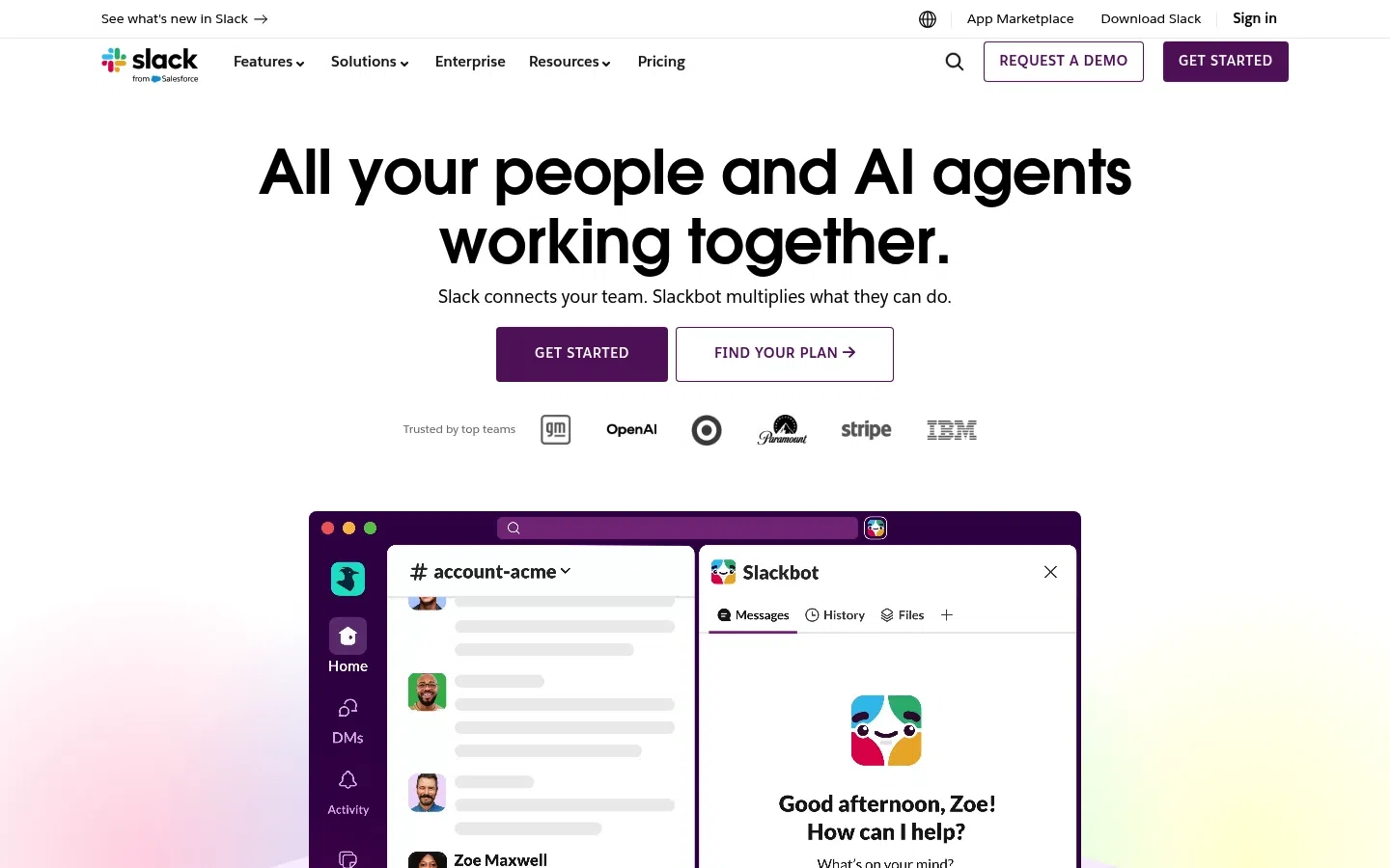
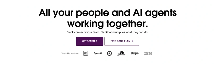
Hero message is broad and AI-led
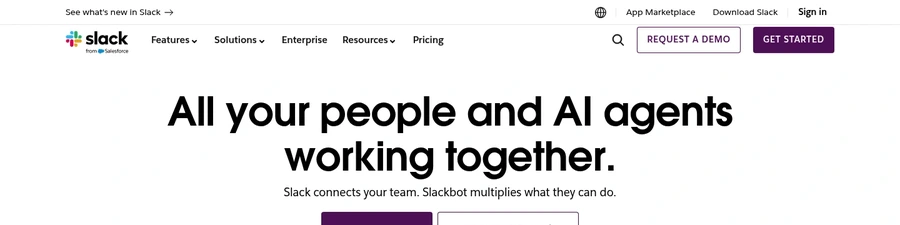
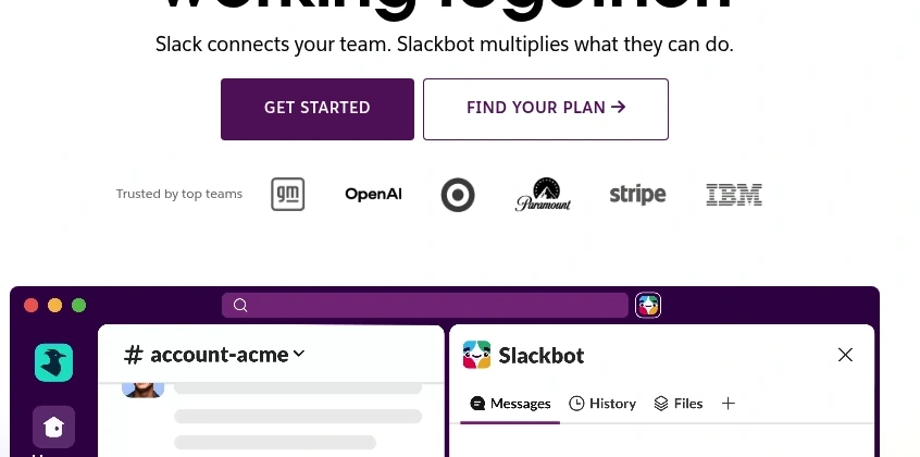
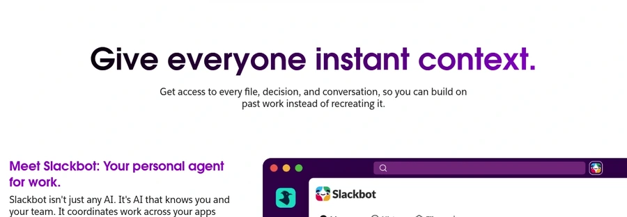
The headline leads with an ambitious AI platform concept instead of a concrete, immediate business outcome.
+1–2%Est. lift
▼

Slack's landing page demonstrates strong brand recognition and visual polish—trust signals are present and the design is contemporary. However, the page attempts to serve too many audiences simultaneously, resulting in a diluted value proposition and unclear next steps. The hero section leads with AI ambition rather than a concrete business problem solved, and competing CTAs create decision friction instead of guiding visitors toward conversion.
The core issue is strategic positioning over user clarity. Slack assumes visitors already understand what they do and why they need it. For cold traffic or decision-makers unfamiliar with the platform, the page fails to make a compelling, specific case before asking for commitment. Navigation clutter and thin proof amplify this gap, making it difficult for prospects to move confidently from awareness to action.
Replace the AI-first headline with a concrete outcome (e.g., 'Cut meeting time by 40%' or 'One inbox for all team communication') and subordinate AI as a supporting feature, not the headline.
The headline leads with an ambitious AI platform concept instead of a concrete, immediate business outcome.
Consolidate CTAs to a single primary action with a clear secondary option; explain exactly what happens after click (e.g., 'Start free trial—no credit card required' vs. ambiguous 'Get Started').
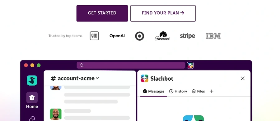
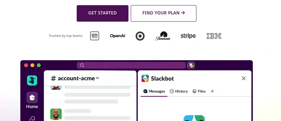
Primary actions like Get Started, Find Your Plan, and Request a Demo compete without a clear explanation of what happens next.
Reduce header navigation to 3–4 essential items; move marketplace, downloads, and secondary links to footer or a utility menu icon.
The header exposes multiple distracting paths such as marketplace, download, sign in, search, and several dropdown categories.
Add quantified social proof near the hero CTA: customer count, retention rate, or a specific outcome metric (e.g., '500K+ teams use Slack daily').
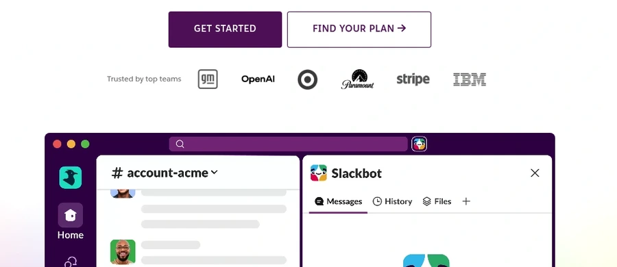
The logo strip is helpful, but it does not add quantified proof, outcomes, or a strong trust claim near the CTA.
Swap the static mockup for an animated or interactive before-and-after that shows a workflow problem and how Slack solves it in <5 seconds.
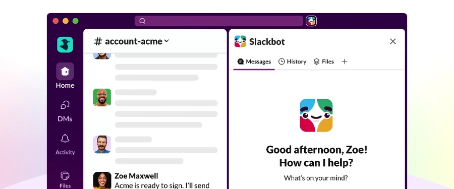
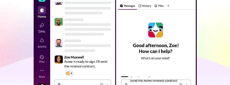
The large product mockup looks polished but remains a static screenshot that does not demonstrate a clear before-and-after or workflow result.
SEE THESE ISSUES ON YOUR PAGE
How would your landing page score?
Rewrite the subheadline to be specific and benefit-driven: replace 'multiplies what they can do' with something like 'Reduce context-switching and ship projects 30% faster.'
The subheadline uses polished but non-tangible language like multiplies what they can do without spelling out a concrete benefit.
Enterprise trust signals like security and compliance are not surfaced near the main conversion area.
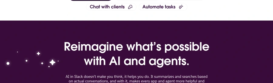
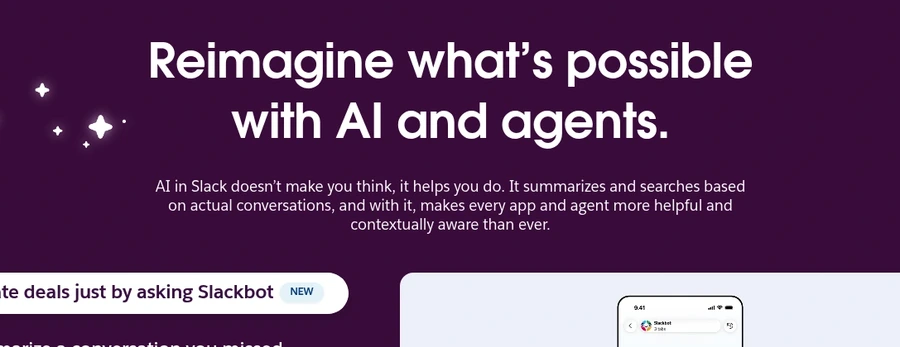
The section about reimagining what is possible with AI and agents is aspirational but not tied to a concrete buying reason.
The feature pills name actions like ask Slackbot and automate tasks without explaining the outcome behind each one.
The page explains access to files, decisions, and conversations, but does not connect that access to a concrete business improvement.
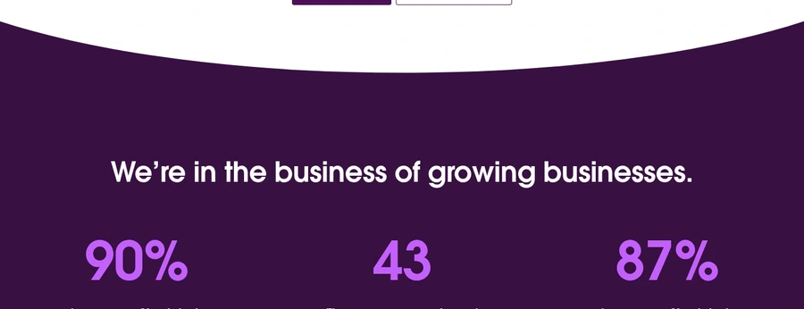
The stats section shows big numbers but does not explain methodology, source, or the business outcome behind them.
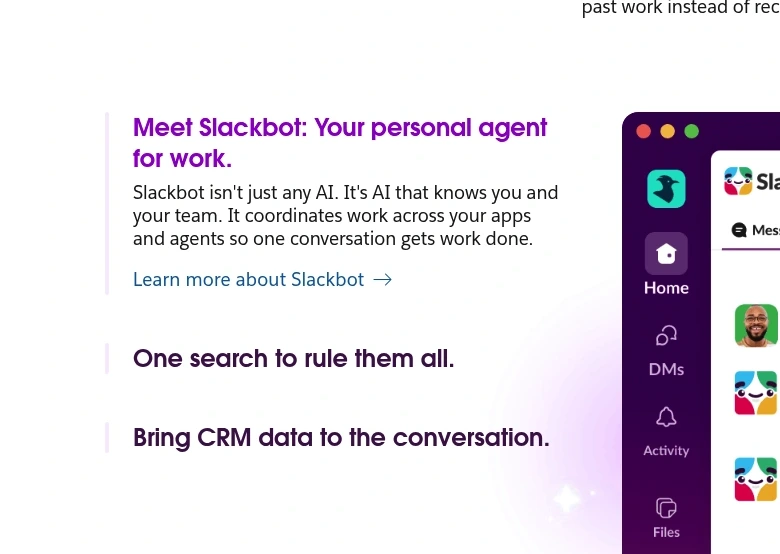
The left-side feature list mixes a detailed item with two bare headings, making the section feel uneven and partially unfinished.
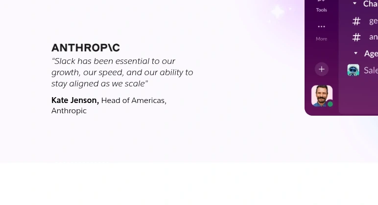
The testimonial is a single quote without a measurable result, comparison point, or richer media support.
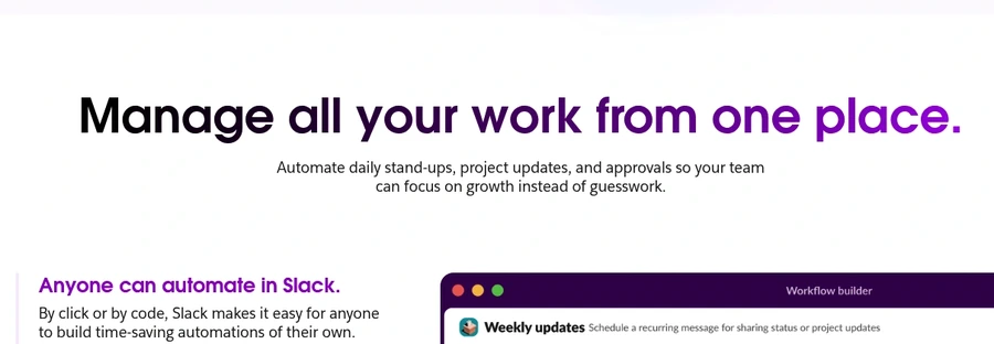
The manage all your work from one place section repeats the core platform promise rather than adding new evidence or objection handling.
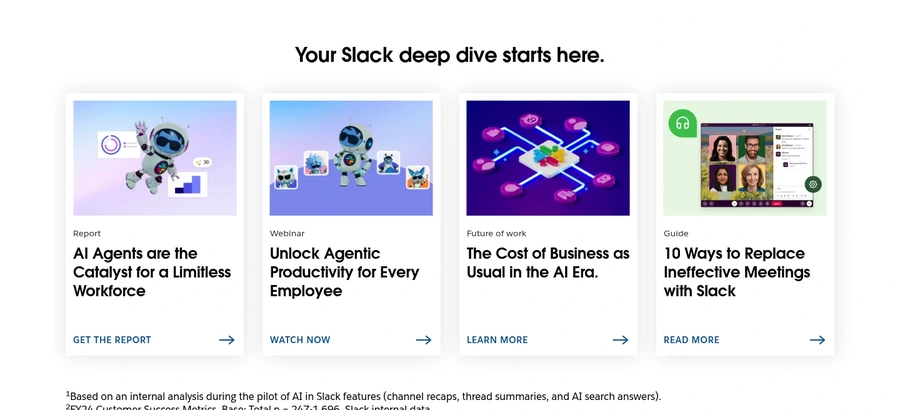
Report, webinar, and guide cards are more educational than conversion-focused and may pull high-intent visitors away from the main CTA.
Slack vs Email and Slack vs Teams links exist, but they are hidden in the footer rather than used in the main pitch.
The page gives no reason to act now, such as quick setup, limited-time incentive, or an immediate-start cue.
GET YOUR OWN AUDIT
First audit just $4.99. Results in ~60 seconds. Money-back guarantee.
Audit my page — $4.99 →