#01
△ CRITICAL
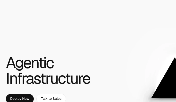
Vague, jargon-heavy hero message
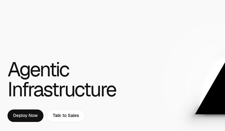
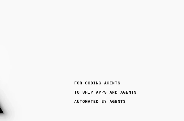
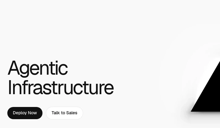
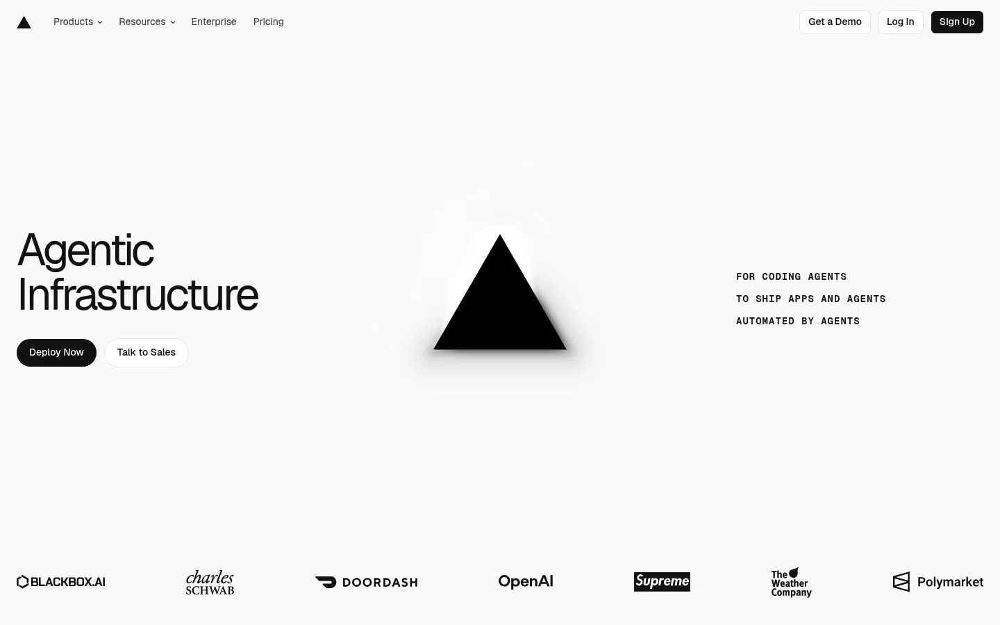
The main value proposition uses abstract language like "Agentic Infrastructure" without clearly stating what Vercel does or the concrete benefit.
+1–2%Est. lift
▼

Vercel offers a platform for developers to build, deploy, and manage web applications with a focus on performance and scalability, targeting software developers and teams.
The main value proposition uses abstract language like "Agentic Infrastructure" without clearly stating what Vercel does or the concrete benefit.
The supporting copy repeats the same agent/coding-agent theme without adding practical detail about outcomes or differentiation.
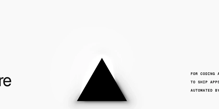
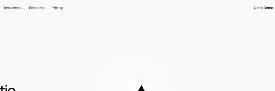
The large abstract triangle is artistic but does not show the interface, workflow, or product outcome.
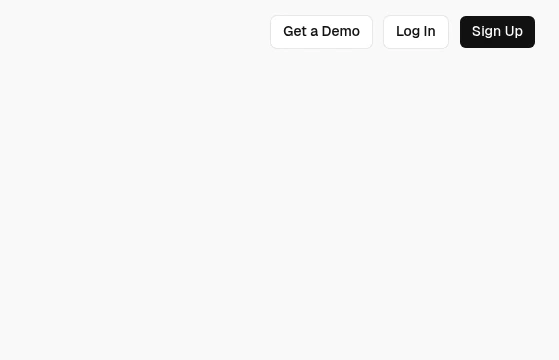
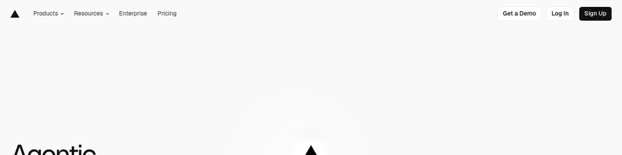
Multiple primary paths like Deploy Now, Talk to Sales, Get a Demo, and Sign Up compete without clear hierarchy.
Deploy Now is action-oriented but does not tell users what happens next, whether it is free, or how hard setup is.
SEE THESE ISSUES ON YOUR PAGE
How would your landing page score?
Pricing exists in the nav, but the hero area provides no cost framing or free-tier cue near the main action.
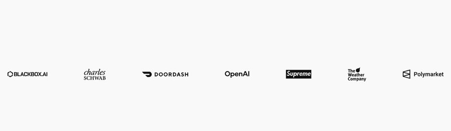
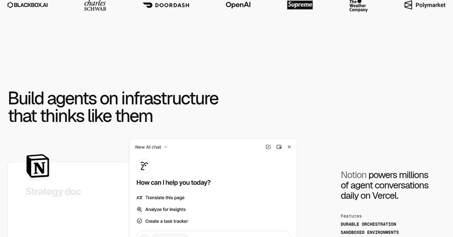
The page shows recognizable logos, but there are no testimonials, verified outcomes, or trust badges near the main CTA.
Customer logos are present, but the page does not explain why they matter or what results they represent.
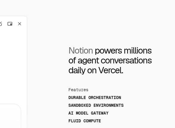
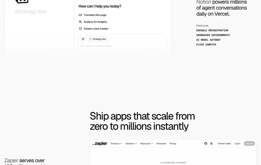
Feature labels like Durable Orchestration, Sandboxed Environments, and AI Model Gateway are technical and do not immediately explain user value.
The homepage strongly centers coding agents and agent conversations without clearly defining the ideal customer or use case boundaries.
The Notion and Zapier sections are large, screenshot-heavy, and partially cut by spacing, so they read more like posters than scannable proof.
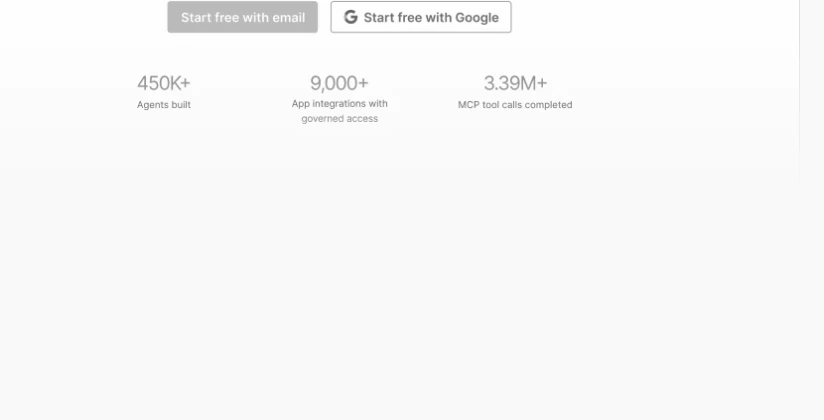
The 450K+, 9,000+, and 3.39M+ numbers are useful, but the supporting labels are small and low-contrast.
The visible page does not show SOC 2, uptime, encryption, SLAs, or similar enterprise-readiness assurances.
The page does not include a launch cue, free-trial prompt, or other reason to act now.
Products, Resources, Enterprise, Pricing, and account links are all visible while the hero value proposition is still abstract.
Large blank bands between sections create a sparse rhythm that can make the page feel thinner and longer than it is.
GET YOUR OWN AUDIT
First audit just $4.99. Results in ~60 seconds. Money-back guarantee.
Audit my page — $4.99 →