#01
△ CRITICAL
Hero message is too abstract
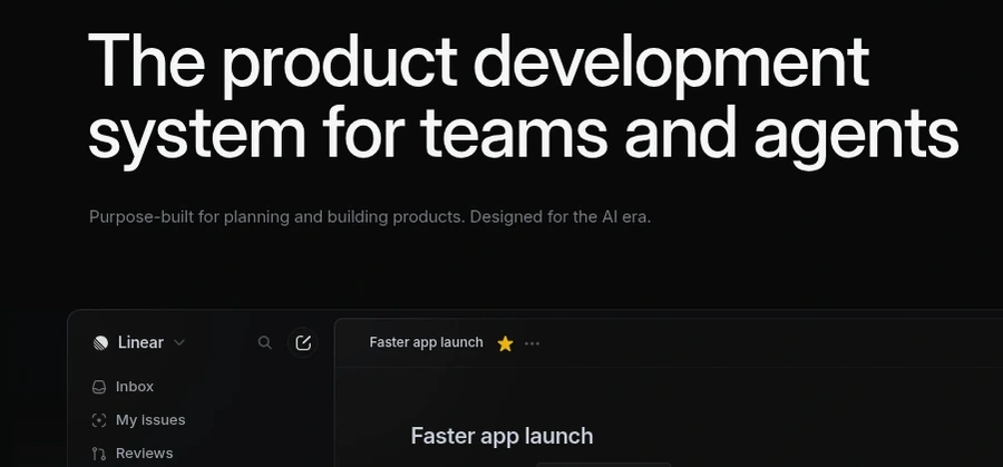
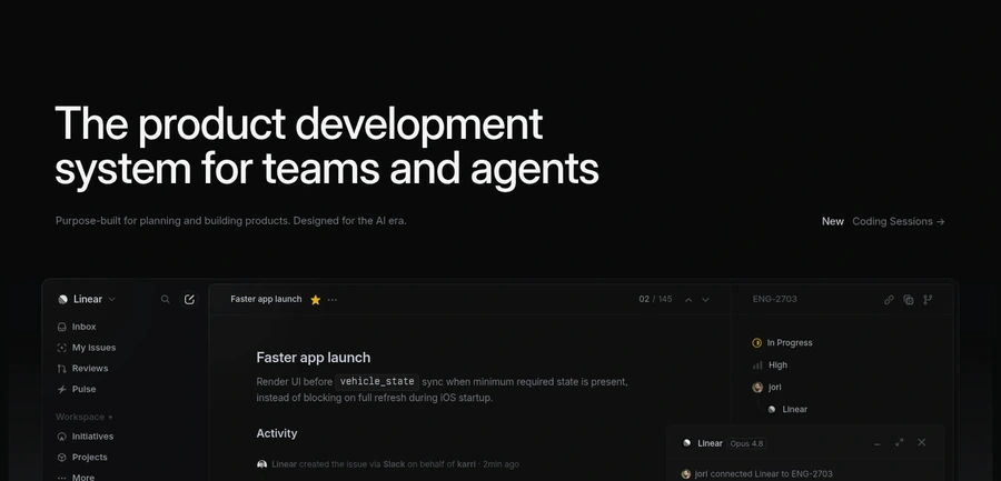
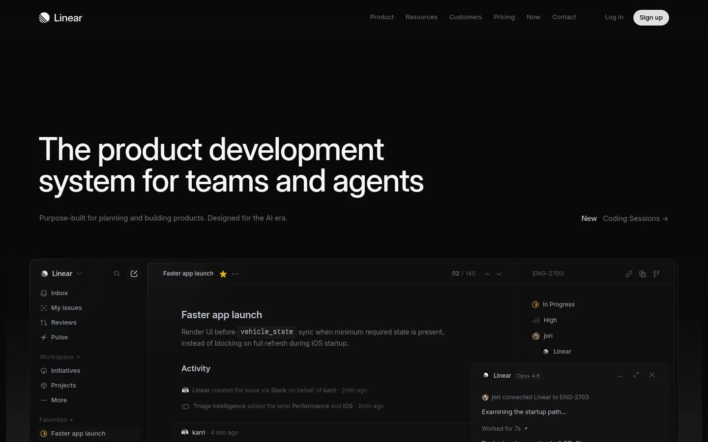
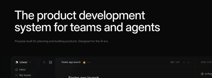
The hero headline uses broad phrases like product development system, teams and agents, and AI era without quickly stating the concrete job-to-be-done.
+1–2%Est. lift
▼

Linear's landing page successfully establishes the brand as a modern, AI-forward product development platform through clean design and confident positioning. The visual hierarchy is strong, and the page conveys technical sophistication—traits that likely resonate with engineering-minded buyers.
However, the page prioritizes brand narrative over conversion clarity. The hero message assumes visitor familiarity with Linear's category and benefits, while the absence of a prominent CTA directly under the value prop creates friction for ready-to-convert users. Most critically, the page relies on logo credibility alone, missing the opportunity to anchor trust through specific outcomes, compliance badges, or customer proof points near high-intent moments.
Replace abstract language ('product development system in the AI era') with one concrete job statement—what specific problem does Linear solve for the user's daily workflow.
The hero headline uses broad phrases like product development system, teams and agents, and AI era without quickly stating the concrete job-to-be-done.
Add a high-contrast, primary CTA button (not just signup in nav) directly below or adjacent to the hero headline with clear microcopy like 'Start Free' or 'See Demo'.
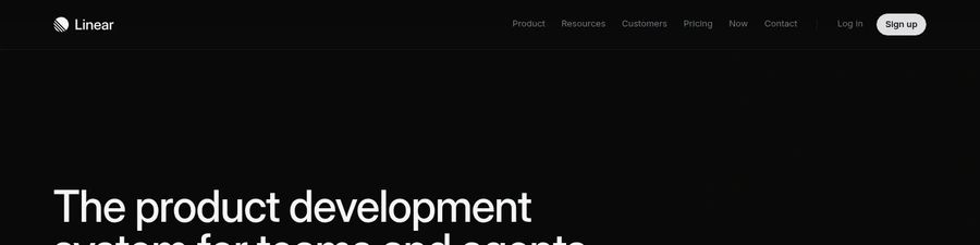
The main above-the-fold action is only a small Sign up button in the top navigation, with no dedicated CTA beside the value proposition.
Embed at least one quantified customer result (e.g., '40% faster sprint planning') or short testimonial quote near the main CTA and again in a mid-page social proof cluster.
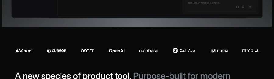
The page shows customer logos but no testimonials, quantified outcomes, or case-study proof near the main persuasive sections.
Place trust markers—SOC 2, no-credit-card notice, or single-sentence security statement—within arm's reach of the primary conversion button.
There are no obvious security, compliance, or no-credit-card reassurance signals close to the main conversion area.
Reduce nav items to five core actions (Product, Pricing, Customers, Log in, Sign up); move Resources and Contact to footer or secondary menu.
The nav includes many competing items such as Product, Resources, Customers, Pricing, Now, Contact, Log in, and Sign up.
SEE THESE ISSUES ON YOUR PAGE
How would your landing page score?
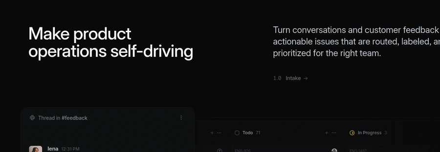
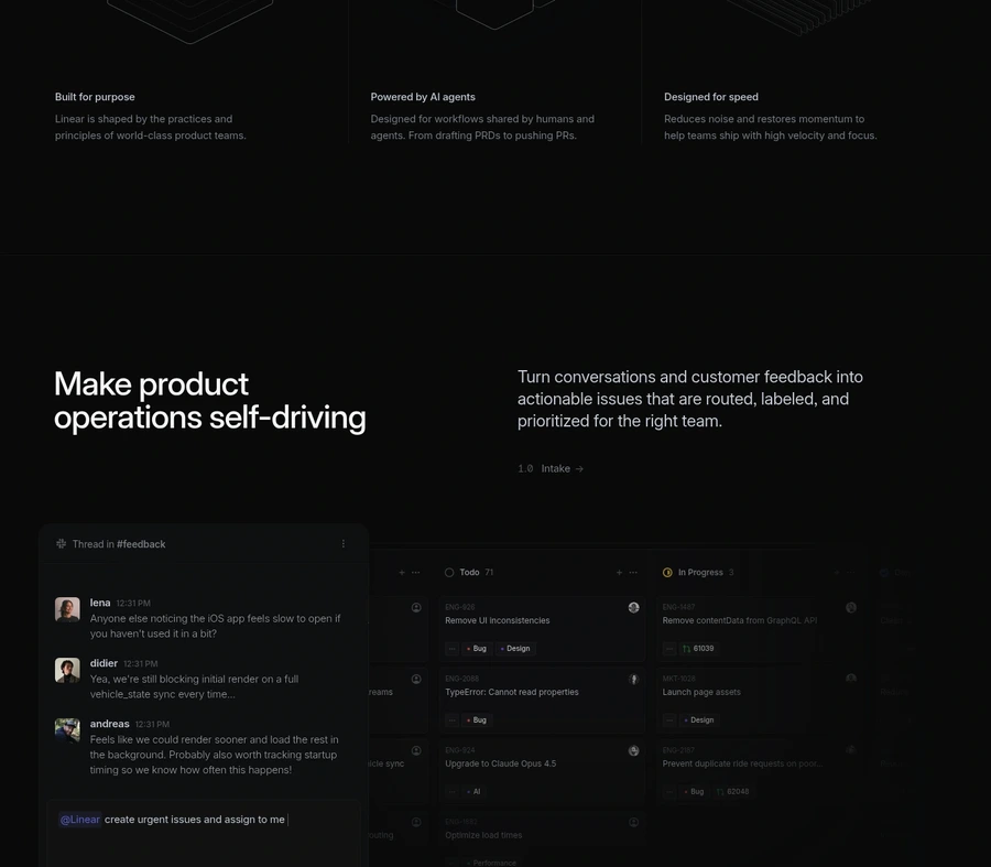
Reframe feature headlines around user outcomes rather than product capabilities—e.g., 'Ship features 3x faster' instead of 'Make product operations self-driving'.
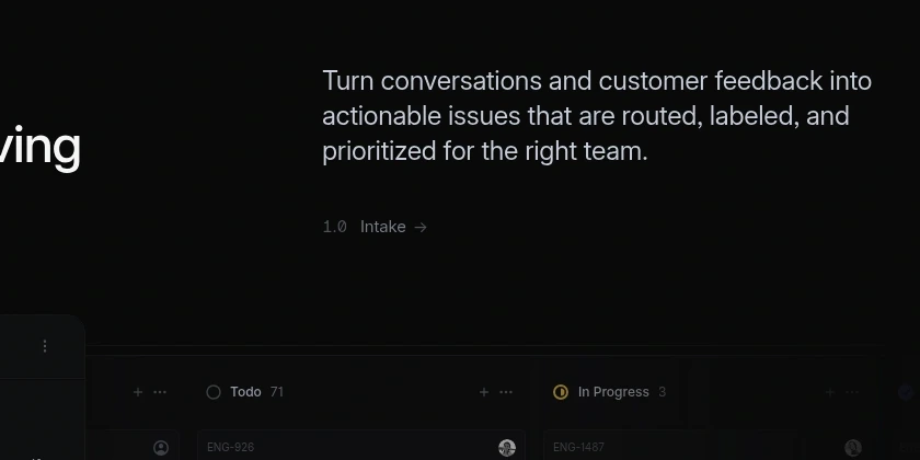
Section headlines like Make product operations self-driving and Understand progress at scale sound polished but remain broad and non-specific.
The 1.0 Intake, 2.0 Plan, and 5.0 Monitor links are small and low-contrast, so they do not read as strong calls to action.
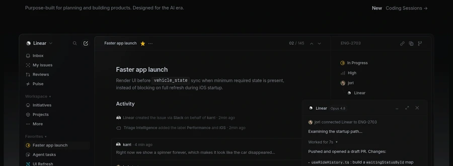
The product mockups are visually impressive but dark, dense, and hard to understand at a glance.
Several parts of the page use excessive negative space between headline, body copy, and illustrations.
Pricing is only available as a link, with no visible pricing summary, plan guidance, or qualification hint on the homepage.
The bottom CTA says Get started without clarifying whether it is a free signup, demo request, or sales-led flow.
The line Built for the future. Available today. sounds polished but does not explain the practical benefit of clicking.
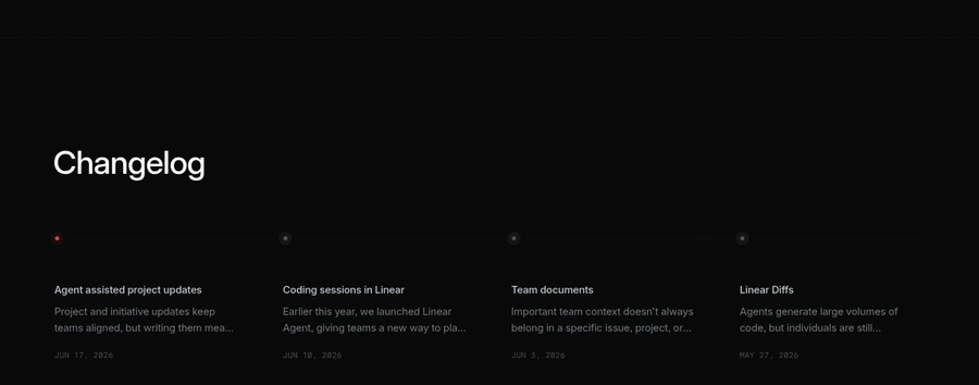
The changelog section shows activity, but it does not directly address objections or guide the visitor toward conversion.
The page does not visibly answer common questions about onboarding, integrations, security, pricing structure, or team fit.
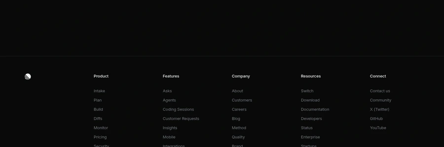
Pricing, security, documentation, and enterprise-related links are present but tucked into a dense footer utility area.
GET YOUR OWN AUDIT
First audit just $4.99. Results in ~60 seconds. Money-back guarantee.
Audit my page — $4.99 →